01. WHAT IS SIMLY
02. OVERVIEW
Task
Timeframe
Tools
03. OBJECTIVE
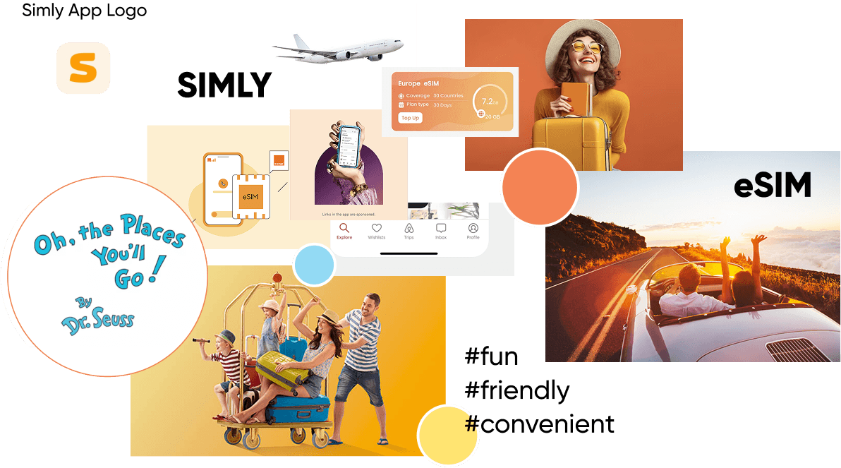
04. WHY SIMLY


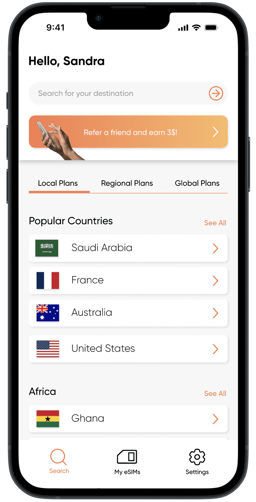
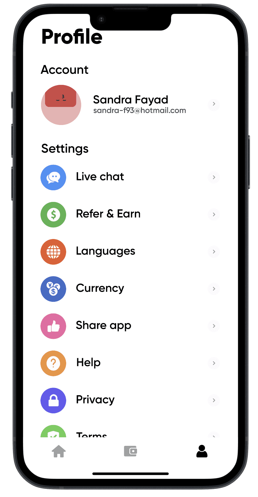
05. HEURISTIC ANALYSIS
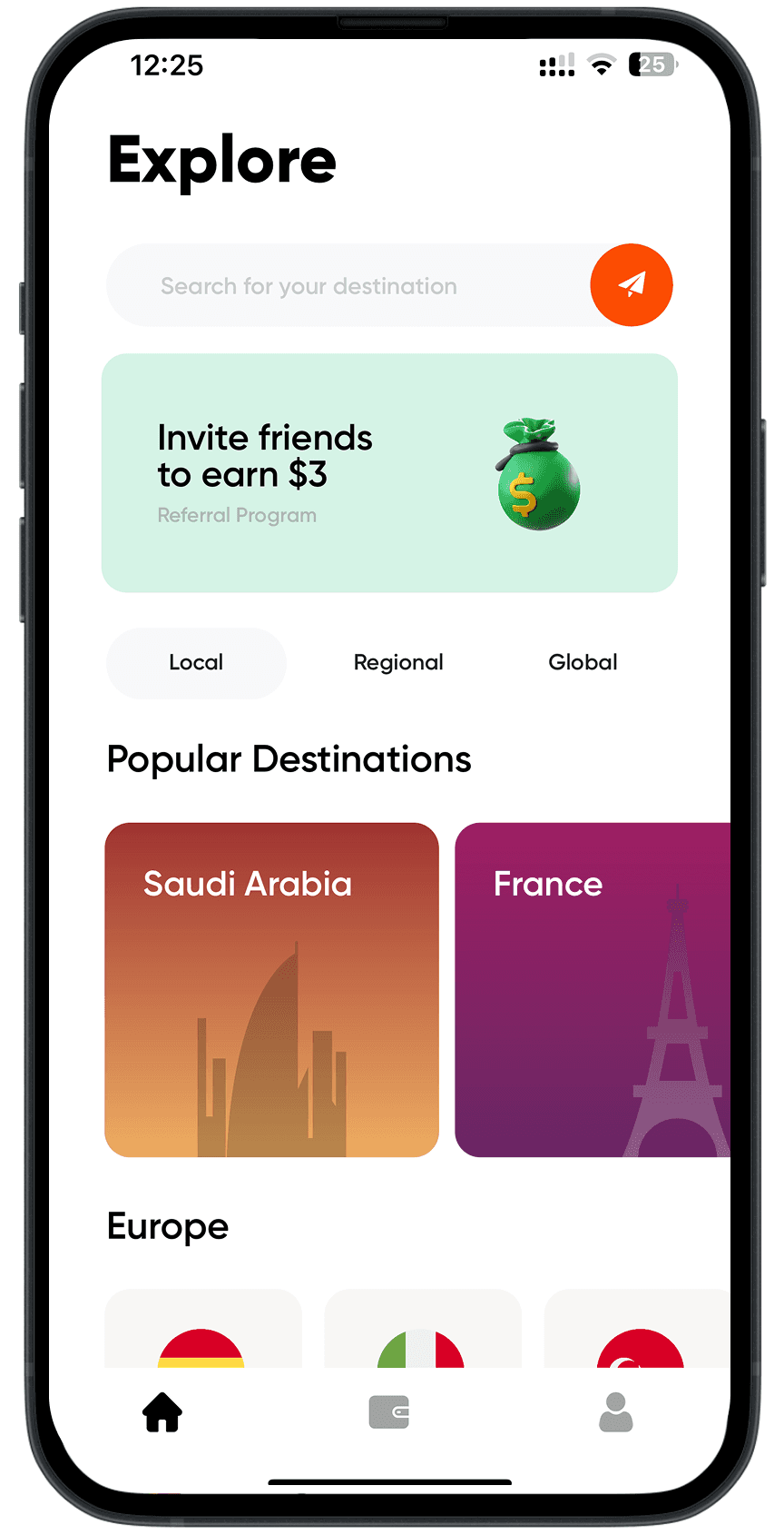
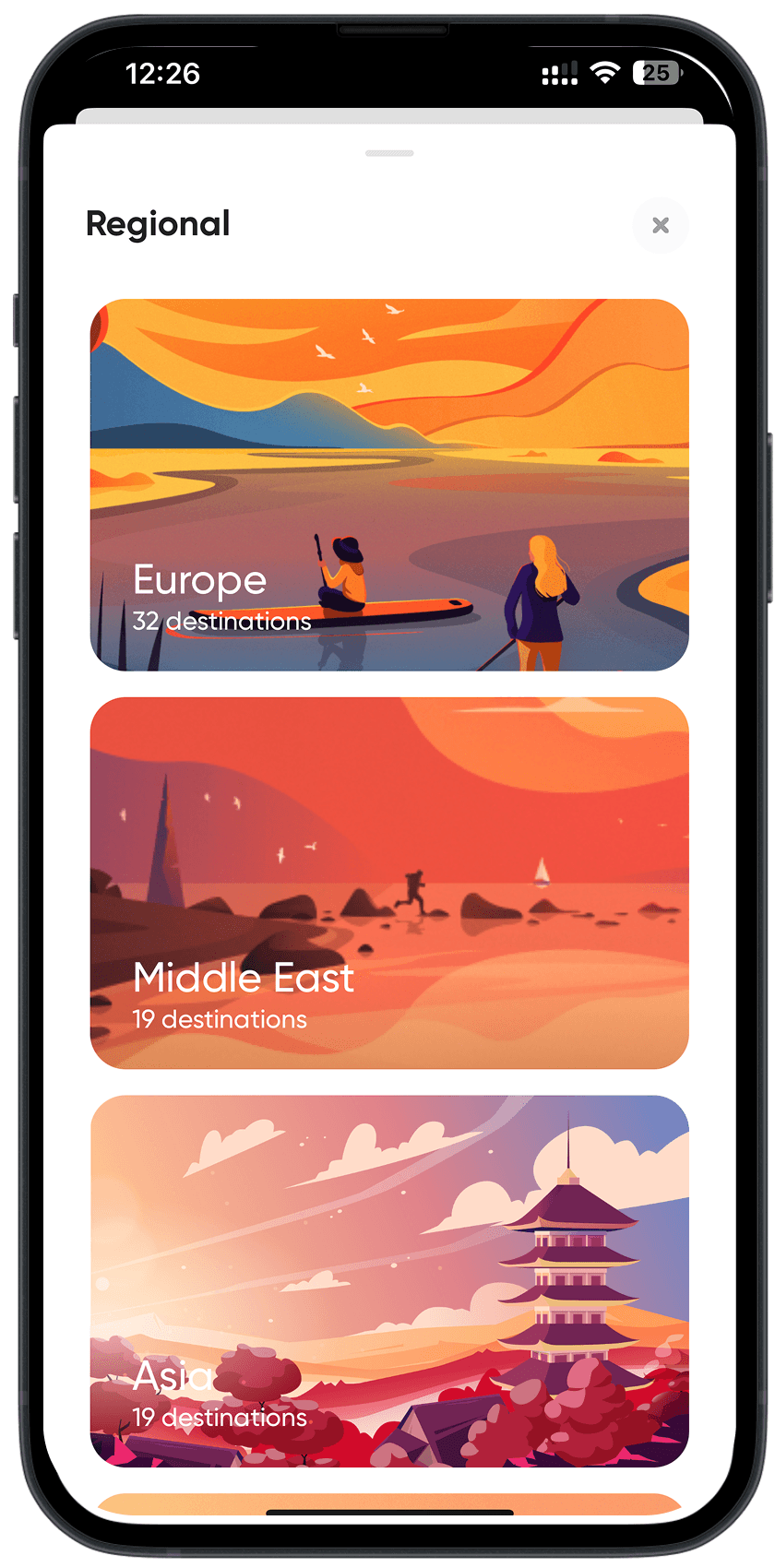
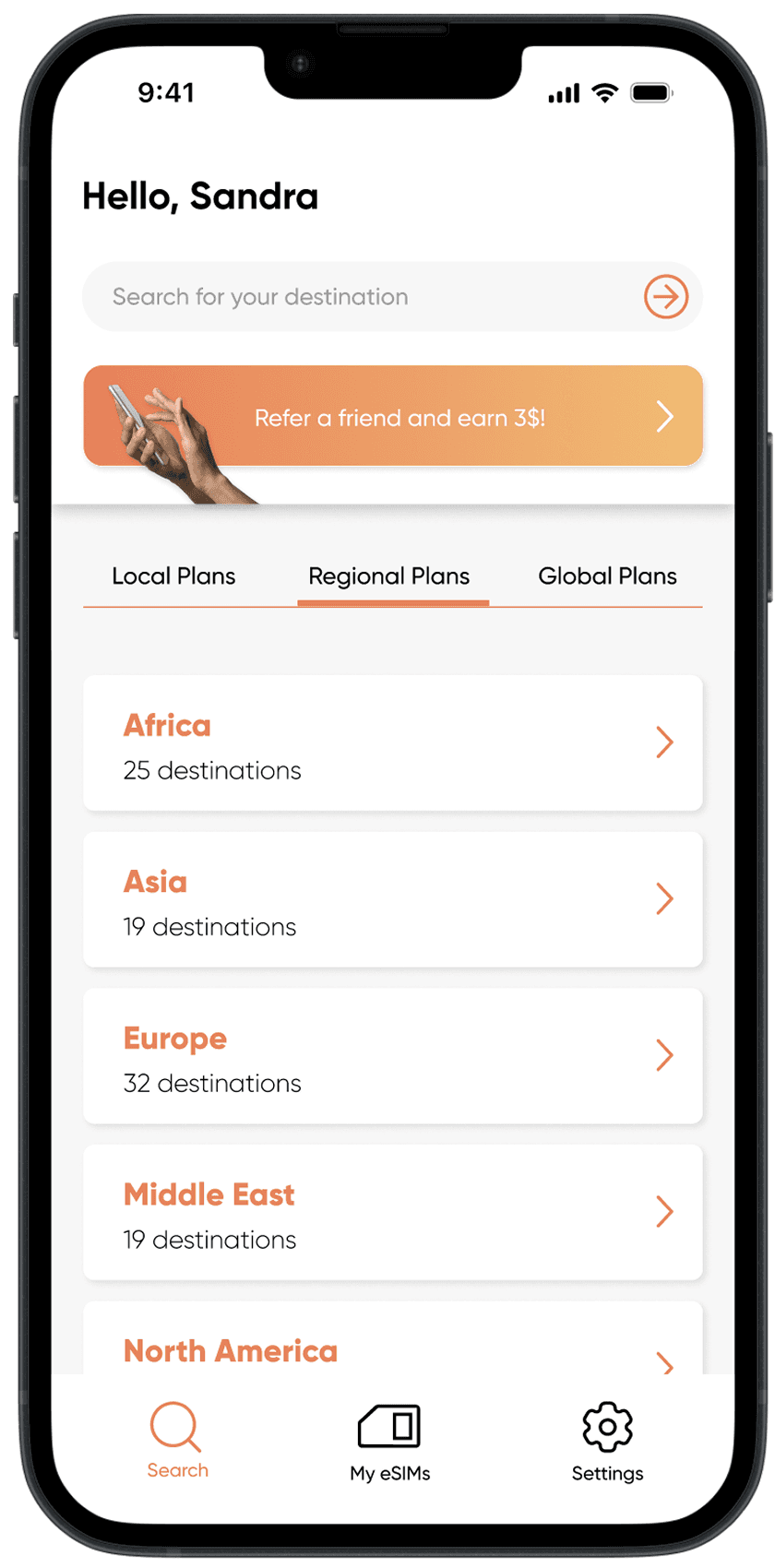
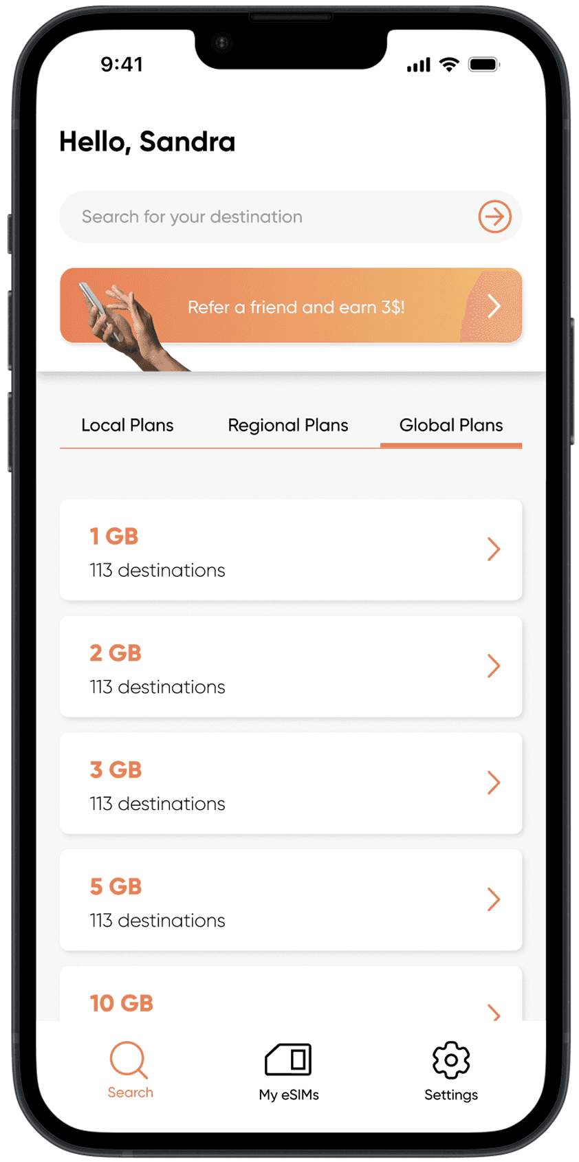
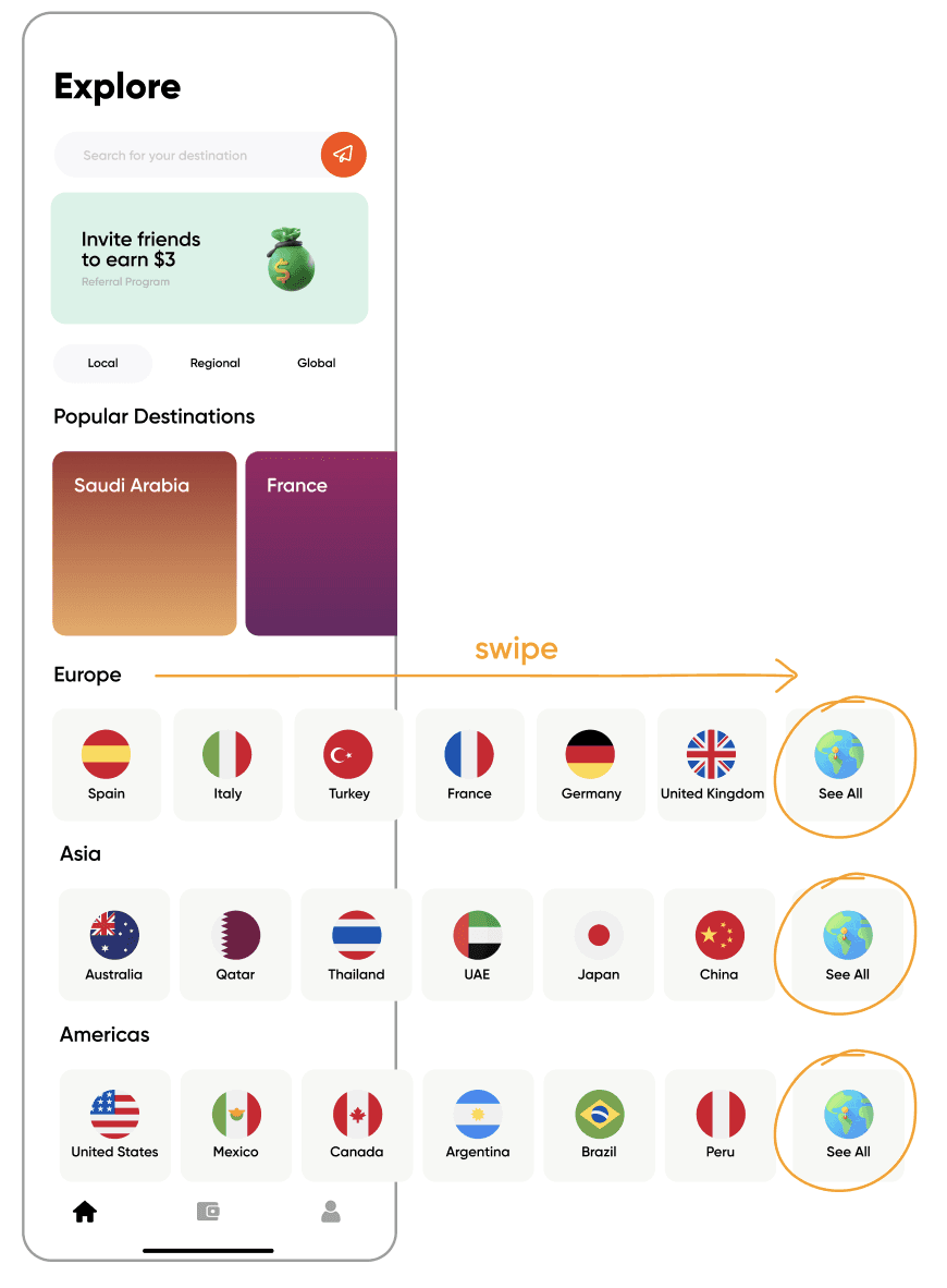
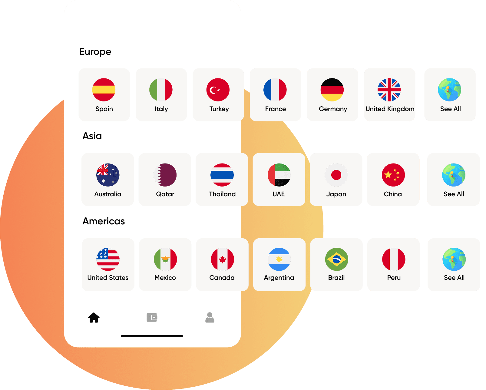
The size of the country buttons is inconsistent.
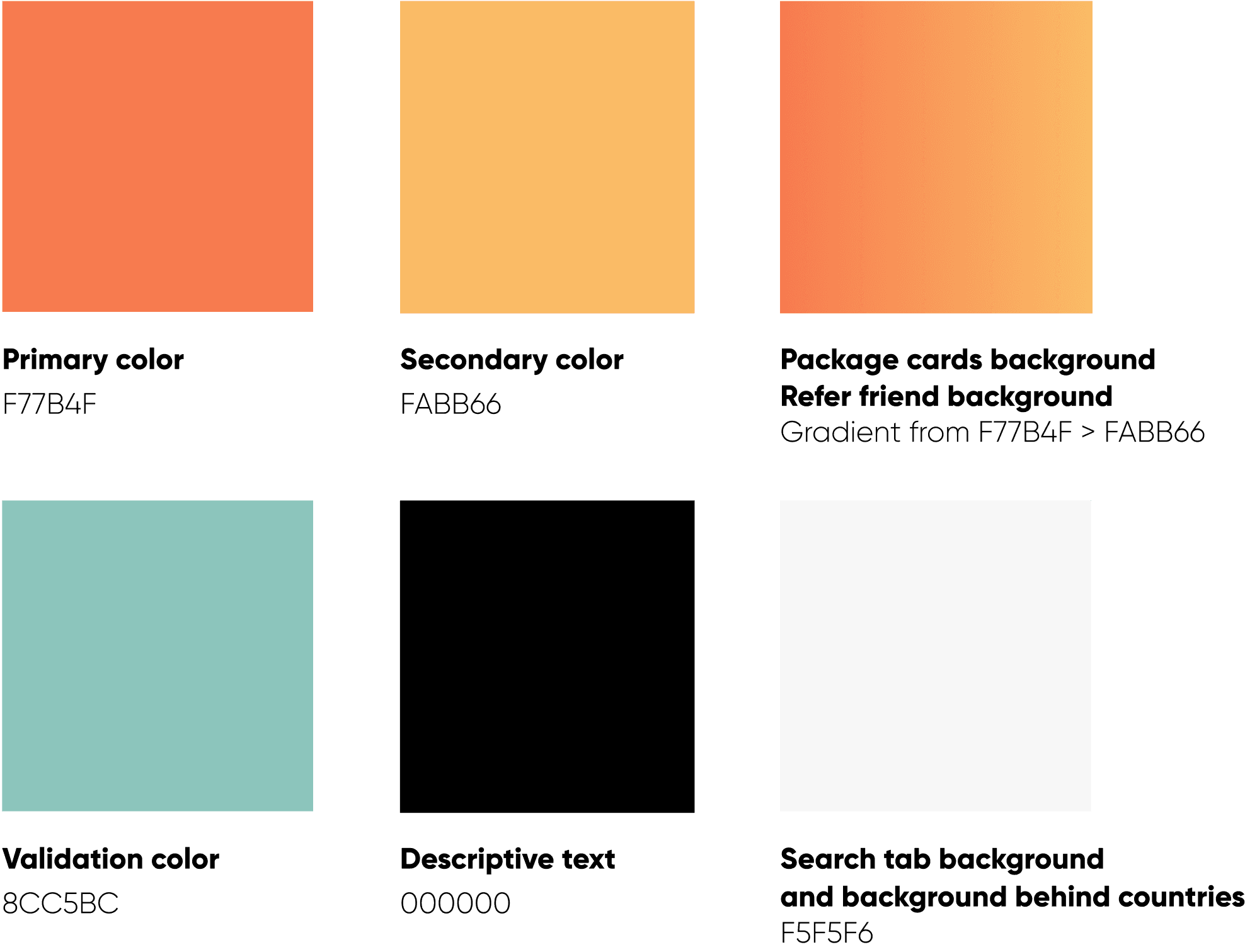
There are no clear branding colors.
The visual elements don’t have the same style.
There is no repetition or clear hierarchy in the font sizes used.
There is no logical order in how the countries and regions are listed.
The icons are misleading in terms of what they represent.
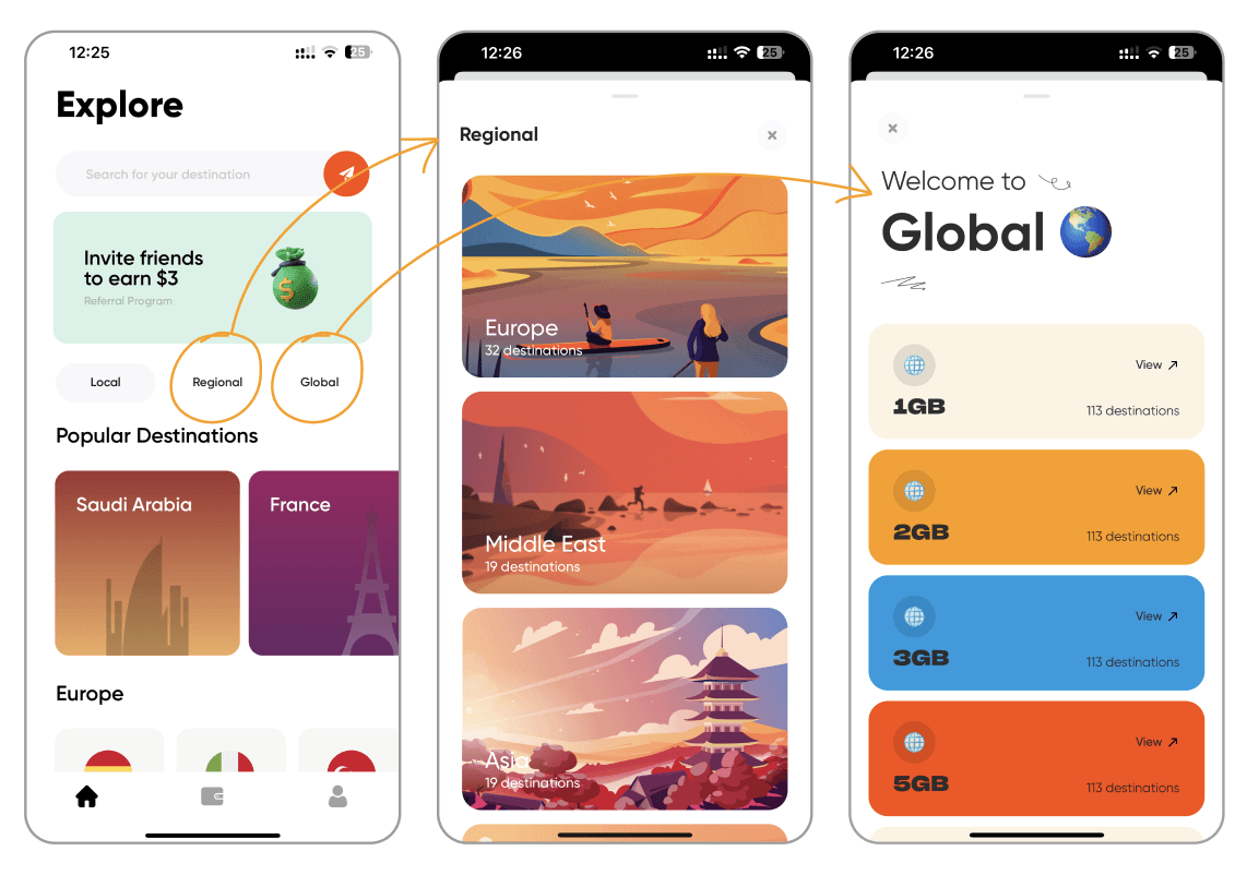
The local/regional/global buttons don’t behave the same way.
The “See All” countries button is hidden at the end of the list after scrolling to the right.
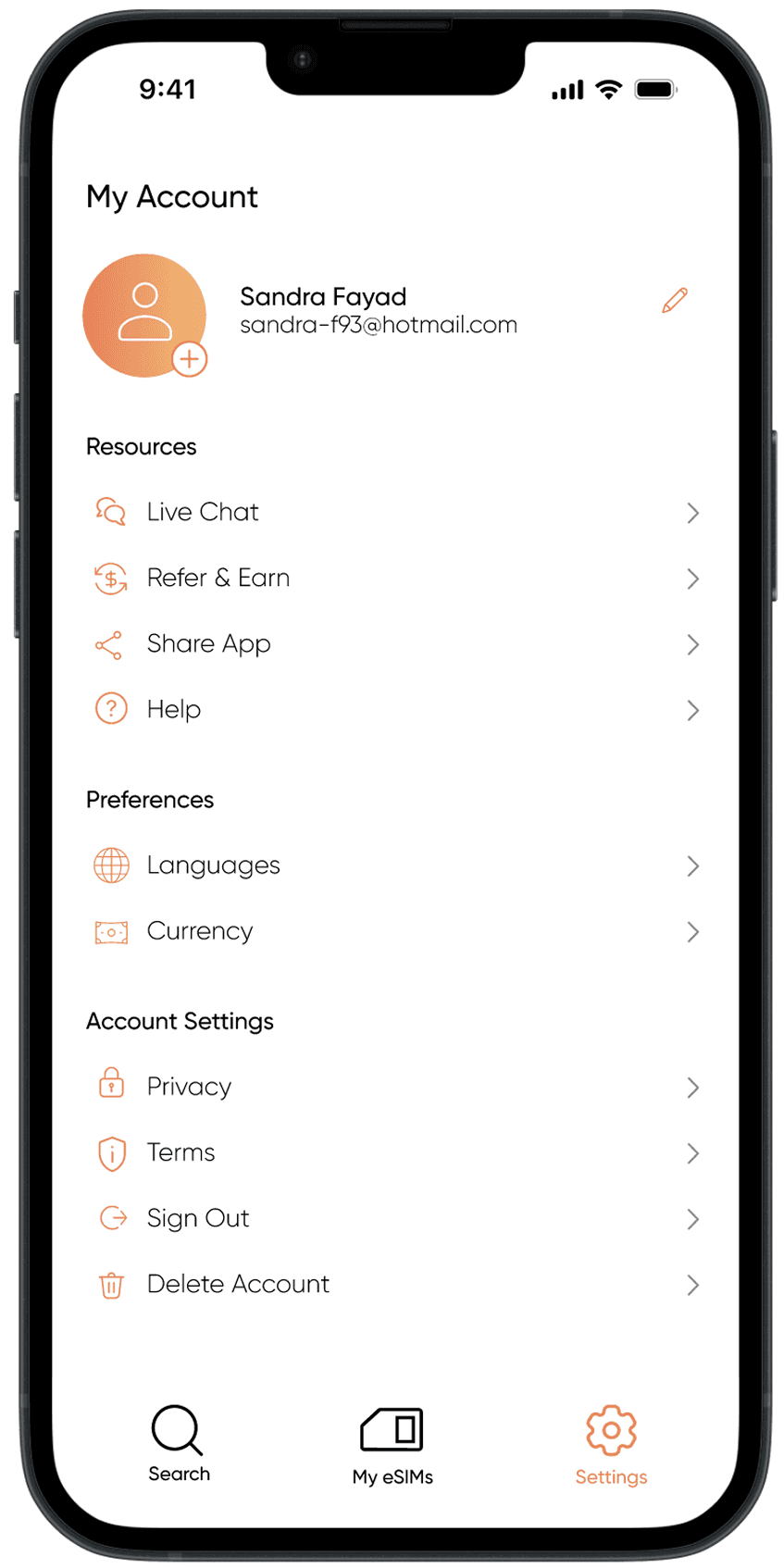
The font sizes on the settings page are excessively large.
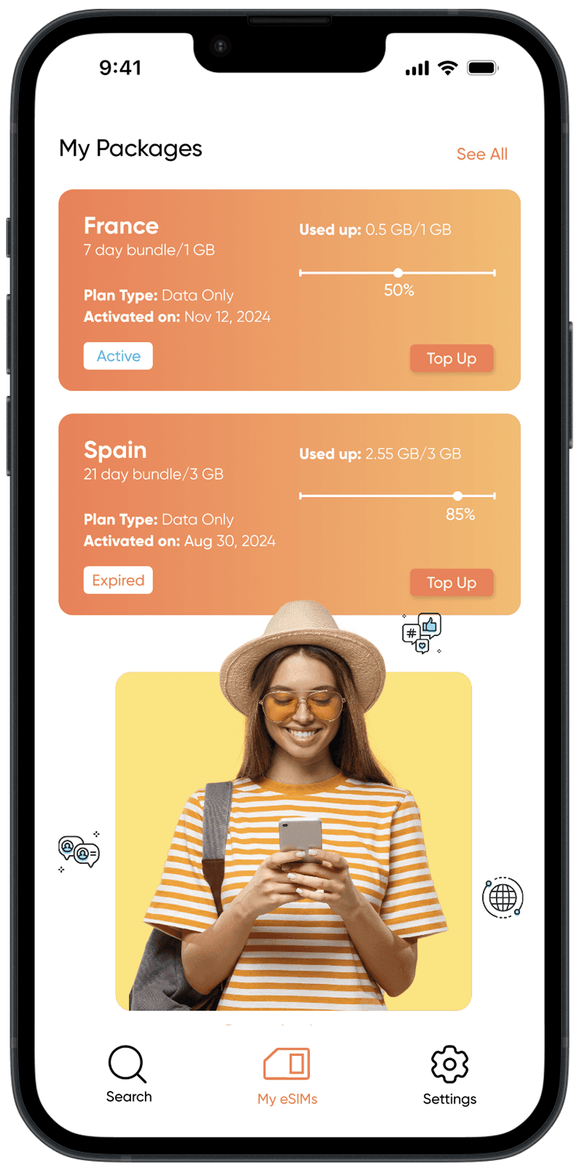
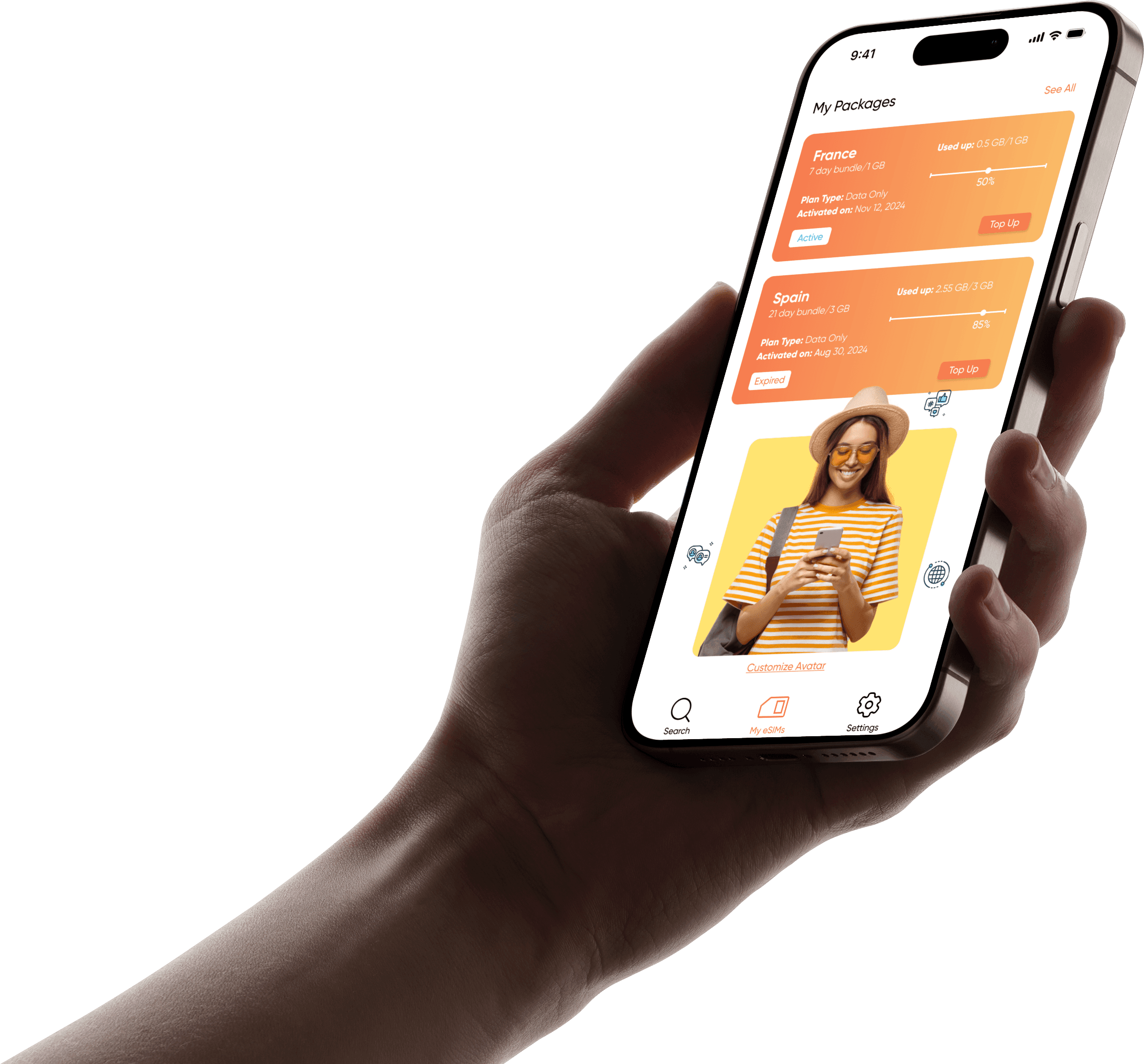
The status of the packages isn’t clearly visible.
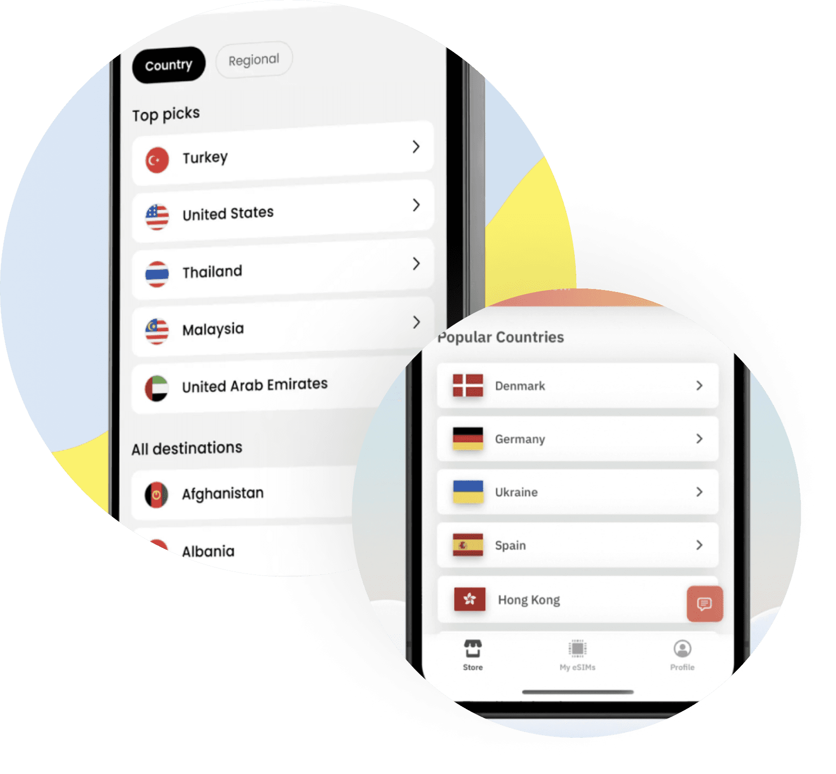
06. VISUAL COMPETITIVE ANALYSIS
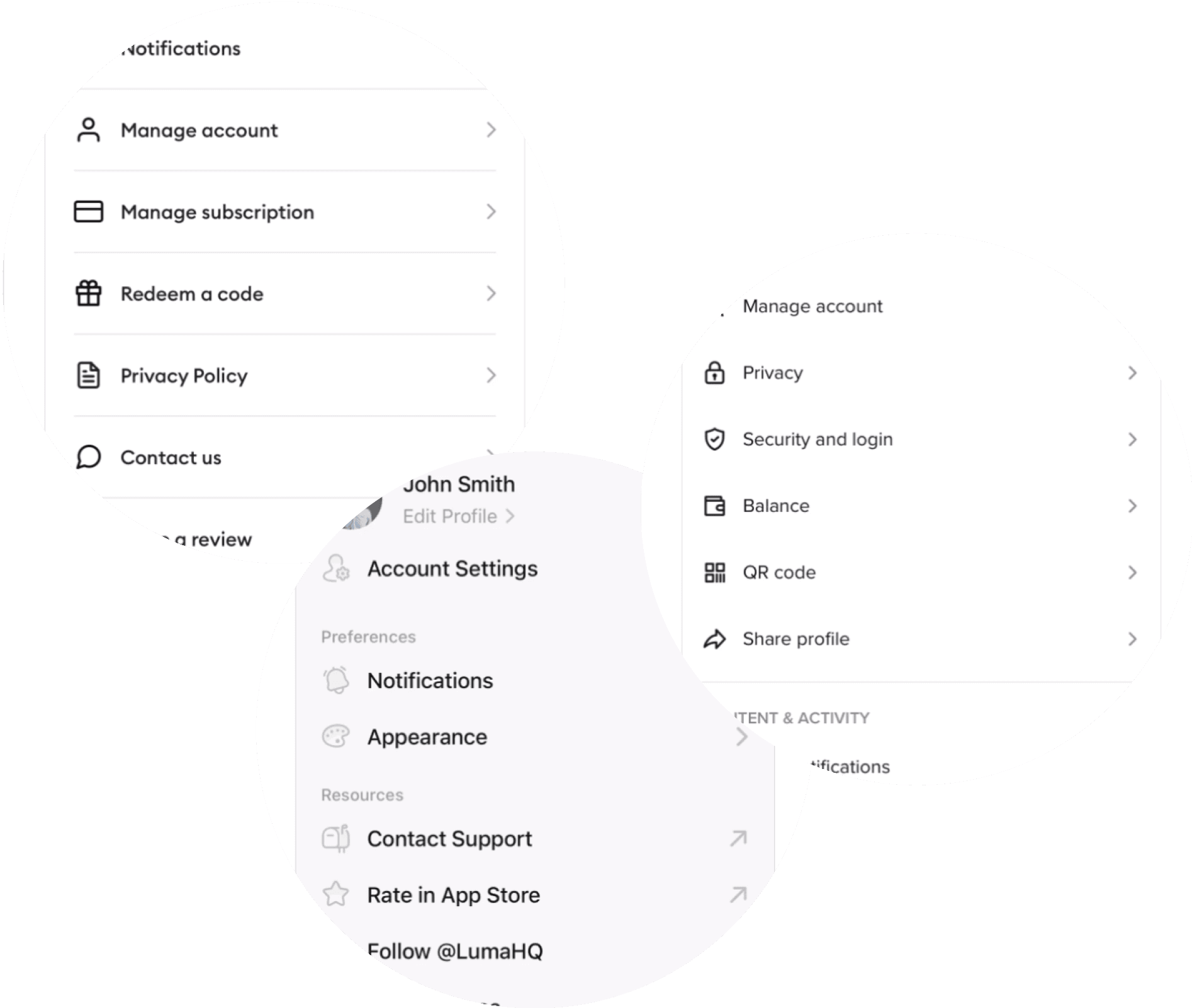

07. THE REBRAND STRATEGY
08. THE DESIGN PROCESS

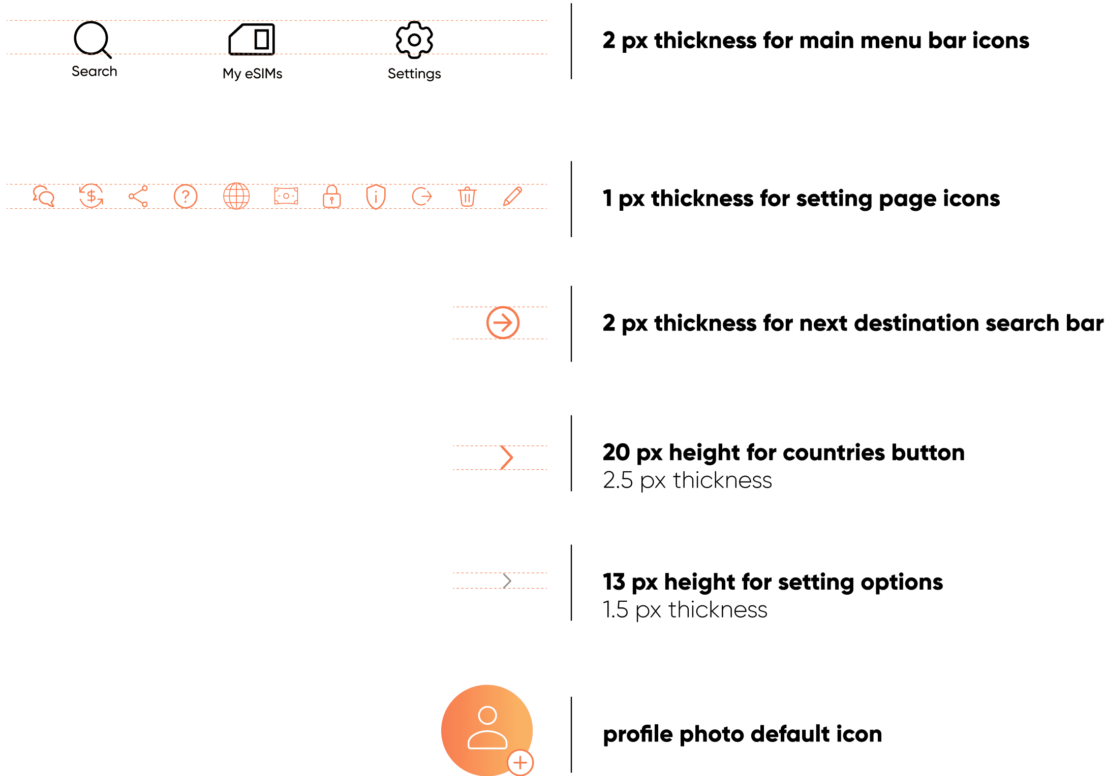
Menu bar icons -
before

Menu bar icons -
after

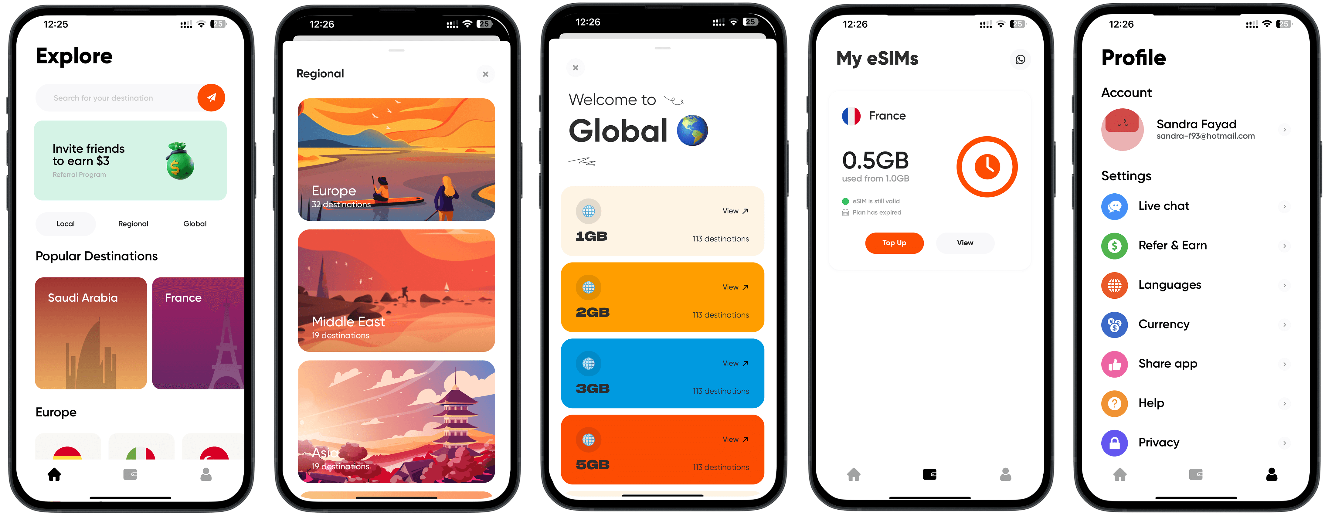
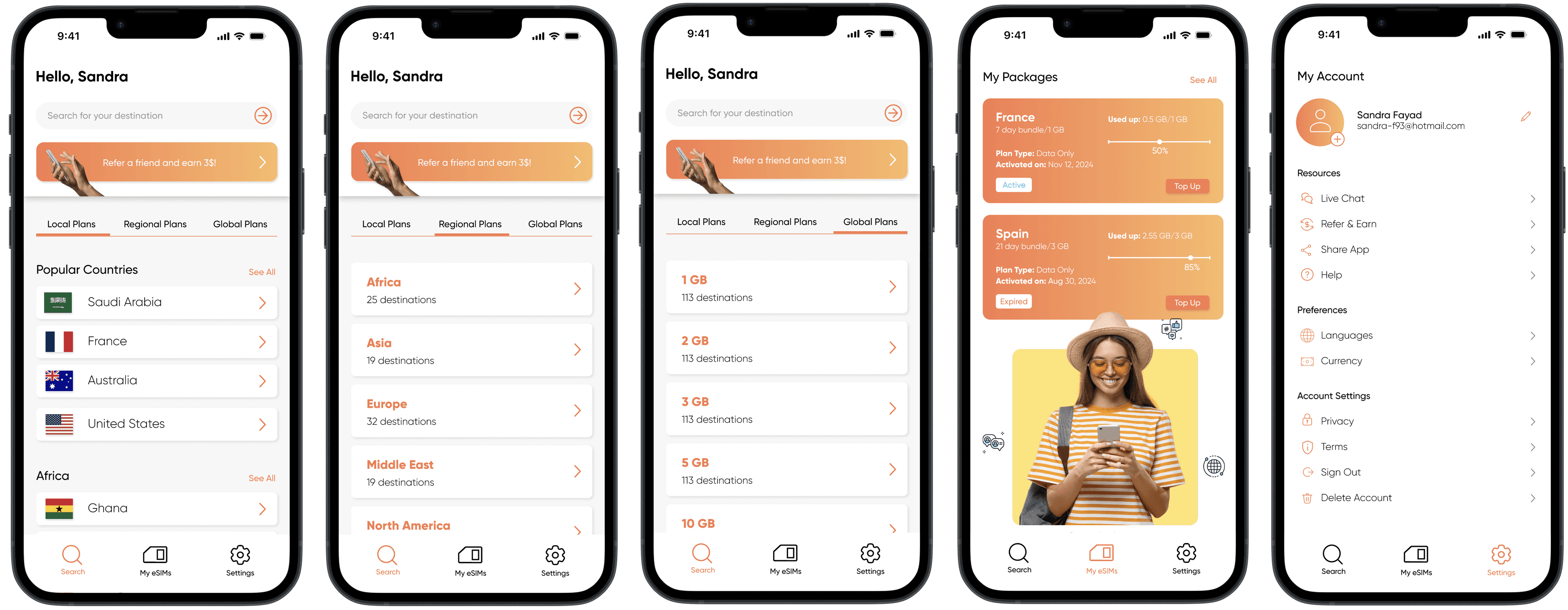
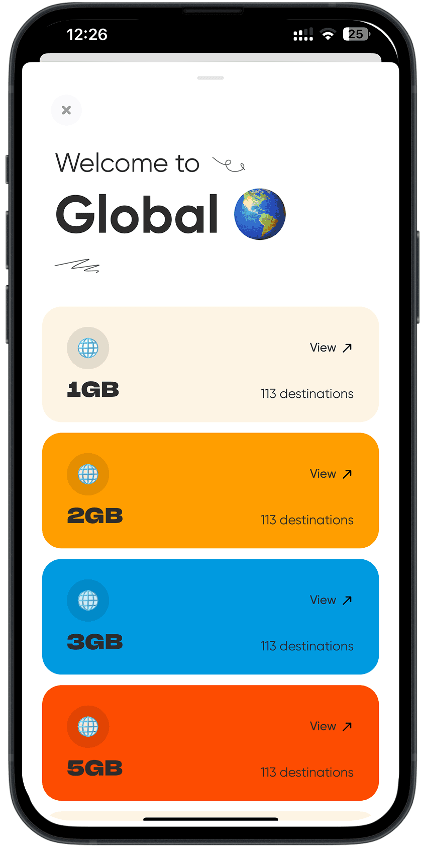
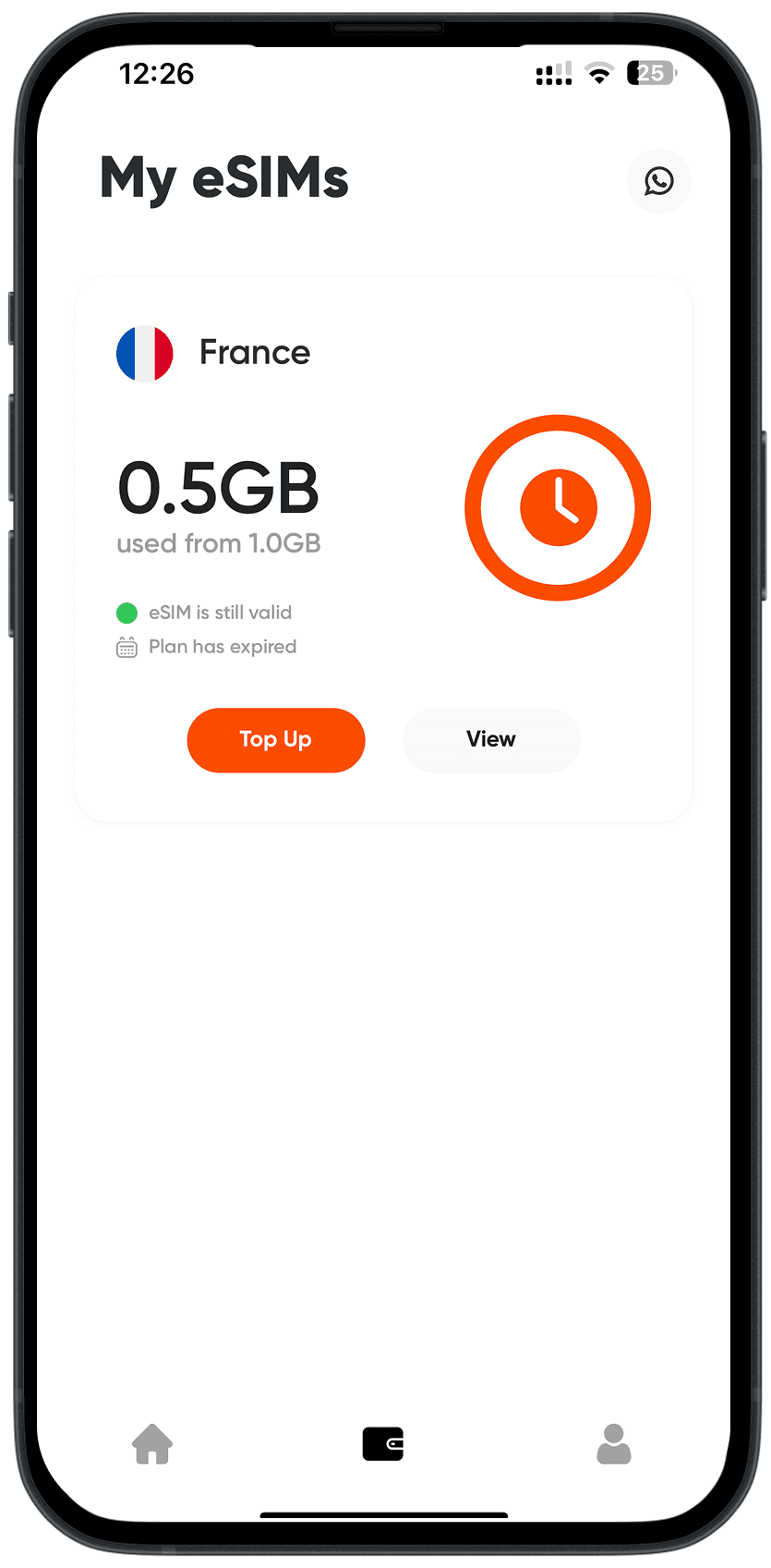
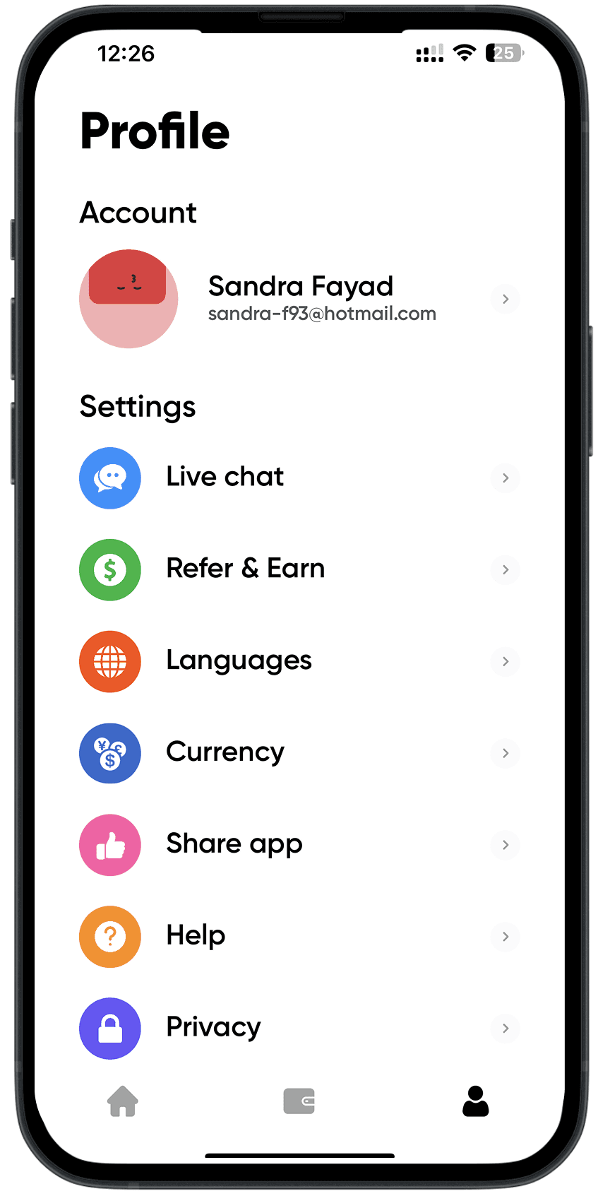
09. THE FINAL PROTOTYPE
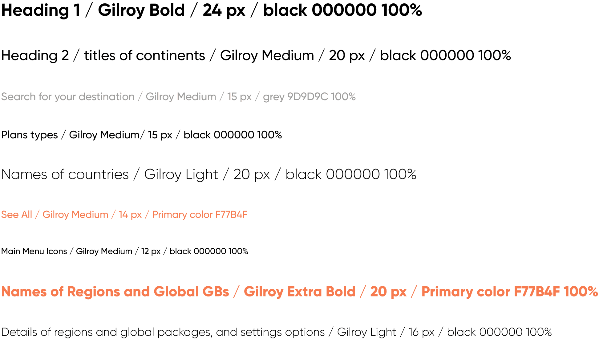
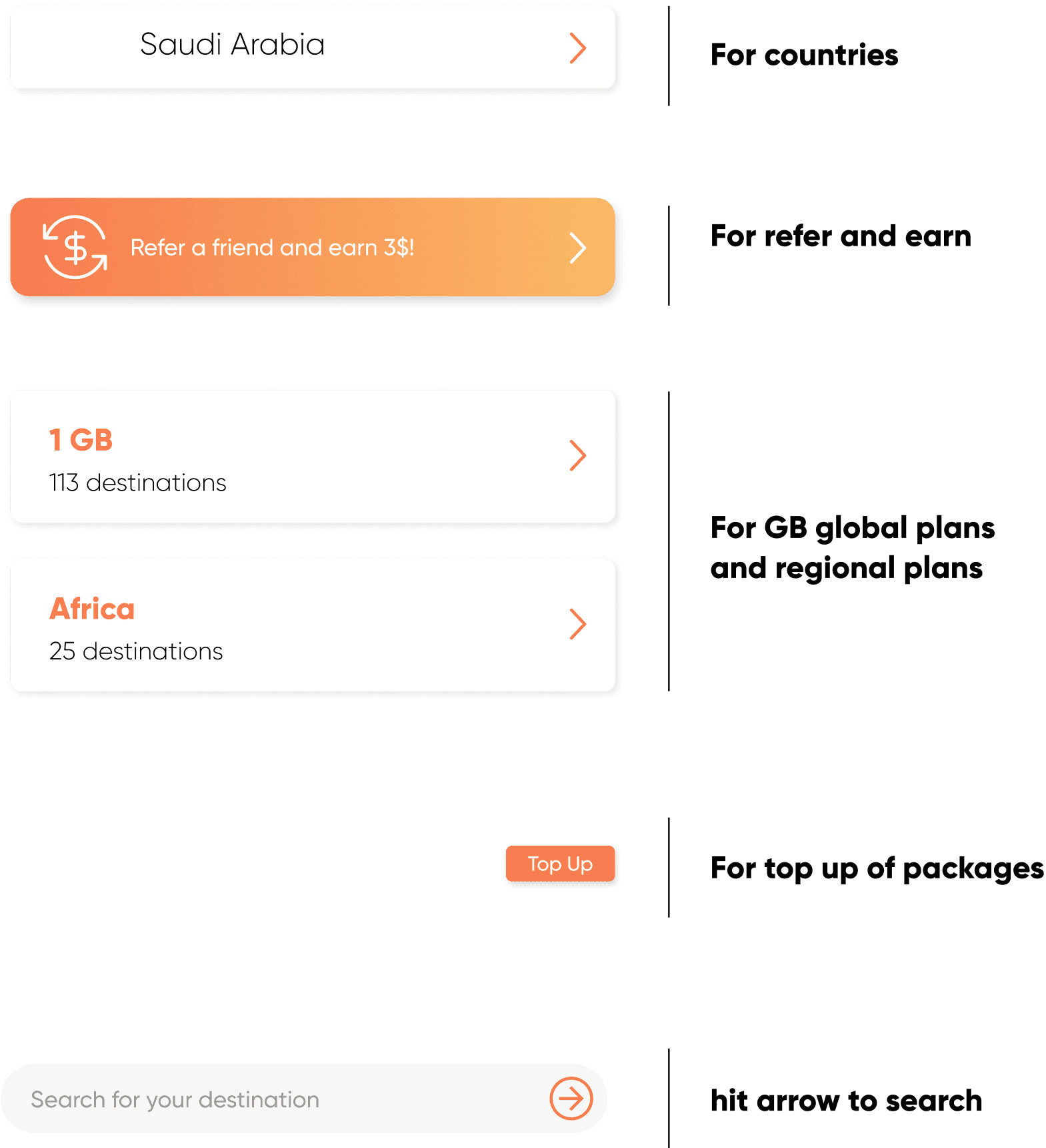
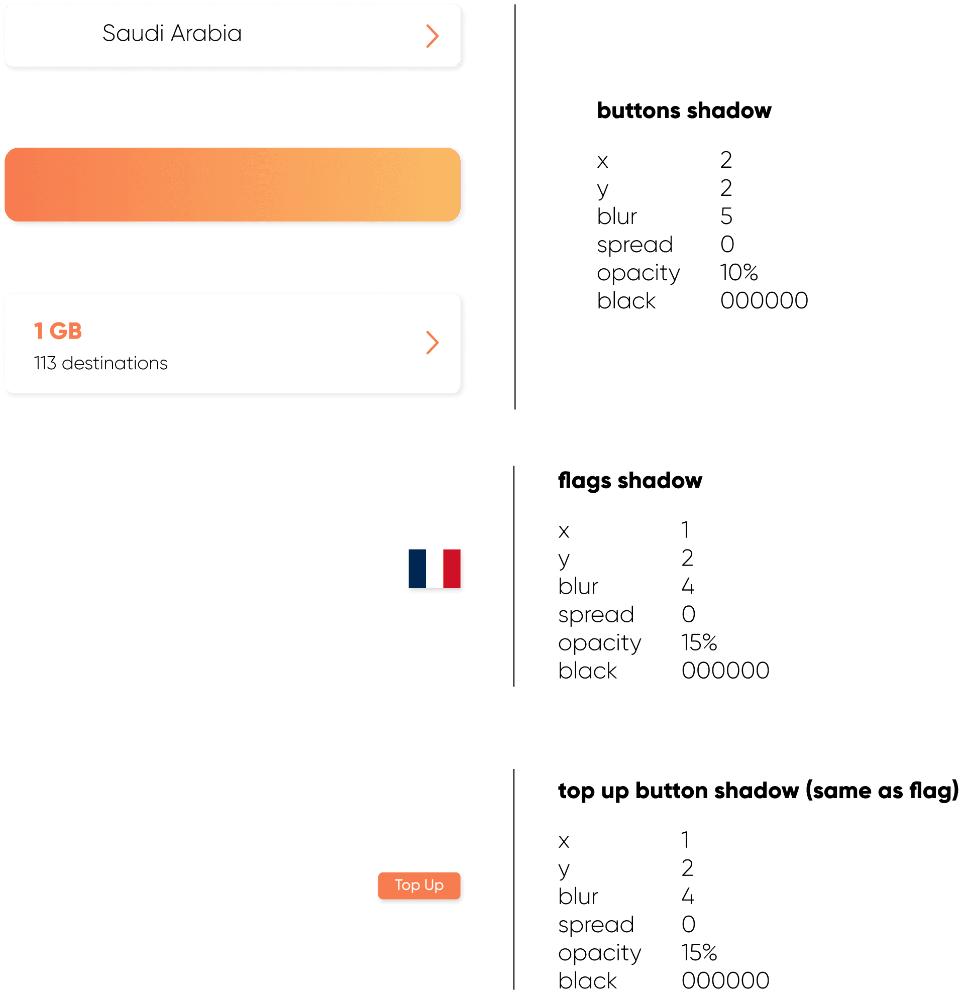
10. THE STYLE GUIDE
11. NEXT STEPS
Design all the other features and pages of the app.
Conduct usability testing and iterate accordingly.
Approach Simly to explore their interest in implementing the redesign.
12. KEY LEARNINGS, THOUGHTS, AND INSIGHTS
Analyzing an app for redesign is the most crucial process. Once you identify the heuristic principles it violates, it becomes easier to know what to fix.
This was the most fun project I’ve worked on so far. Unpopular opinion: the time constraint was a good motivator for me, as I know I work well under pressure.
I’m proud of the outcome, especially knowing the entire redesign came together in one day. I also implemented new tools we learned in Figma, such as text, color, grid, and effect styles, as well as components. I didn’t rush the design process and gave attention to every detail, as I do with all my work.
I realized I work faster alone, without needing to pause for team discussions, which was ideal for this three-day project.