MonCab
MonCab
MonCab
Jump to final prototype
Jump to final prototype
01. WHAT IS MONCAB
MonCab is a French company that operates a marketplace for medical offices, allowing medical practitioners to find and rent office spaces by the hour or on a monthly basis—essentially an 'Airbnb for medical offices.
MonCab is a French company that operates a marketplace for medical offices, allowing medical practitioners to find and rent office spaces by the hour or on a monthly basis—essentially an 'Airbnb for medical offices.
MonCab is a French company that operates a marketplace for medical offices, allowing medical practitioners to find and rent office spaces by the hour or on a monthly basis—essentially an 'Airbnb for medical offices.
02. OVERVIEW
Task
Adding a shared calendar feature
Adding a shared calendar feature
Team
3 UX/UI Designers
3 UX/UI Designers
Timeframe
2 weeks
2 weeks
Tools
Google Forms, Google Meets, Figma, Figjam, Otter, Slack
Google Forms, Google Meets, Figma, Figjam, Otter, Slack
03. ABOUT MONCAB
MonCab is a platform that connects medical practitioners with office spaces available for rent. The offices listed on MonCab are typically owned by medical professionals who receive government reimbursements for their spaces. Common practices in these offices include physiotherapy, massage therapy, dietetics, psychology, osteopathy, and life coaching.

MonCab offers 3 rental types:
MonCab offers 3 rental types:
MonCab offers 3 rental types:
1
1
Full-time:
Monthly basis
2
2
Part-time:
Same time, same day each week; e.g., 10-11 am every Tuesday
3
3
Flexible Package:
Tenants purchase a bundle of hours (10, 15, or 20 hours) and use them as needed, depending on their appointments.
MonCab's specialty
MonCab's specialty

04. CURRENT BOOKING CHALLENGES
MonCab serves two types of users: office owners (space providers) and medical practitioners looking to rent office space (tenants). While the website allows users to view office listings with photos, prices, and approximate locations, the booking process is complicated:
The tenant must send a message to the office owner through the website.
They schedule a site visit.
If they agree, they sign a contract and make a payment.
The MonCab team manually creates a calendar for them on an external shared platform called Witco and guides them to download the app.

However, Witco was originally designed for managing long-term stays in large apartment complexes, not for hourly or part-time office bookings. It lacks essential features such as booking cancellations and clear availability tracking. Owners cannot easily view daily or weekly schedules, and switching between MonCab and Witco creates inefficiencies, leading to frustration for both office owners and tenants.
05. THE GOAL
To streamline the booking process, we aimed to integrate a calendar feature directly into MonCab’s platform.
This would:
Enable tenants to view available slots and book instantly without needing back-and-forth messaging.
Eliminate the need for office owners to navigate Witco for bookings.
Save the MonCab team significant time by reducing manual involvement in setting up and managing calendars.
Provide office owners with a user-friendly dashboard to manage their bookings efficiently, reducing confusion and missed appointments.
By integrating an intuitive scheduling system, MonCab could improve user satisfaction, optimize office utilization, and create a seamless experience for all stakeholders.

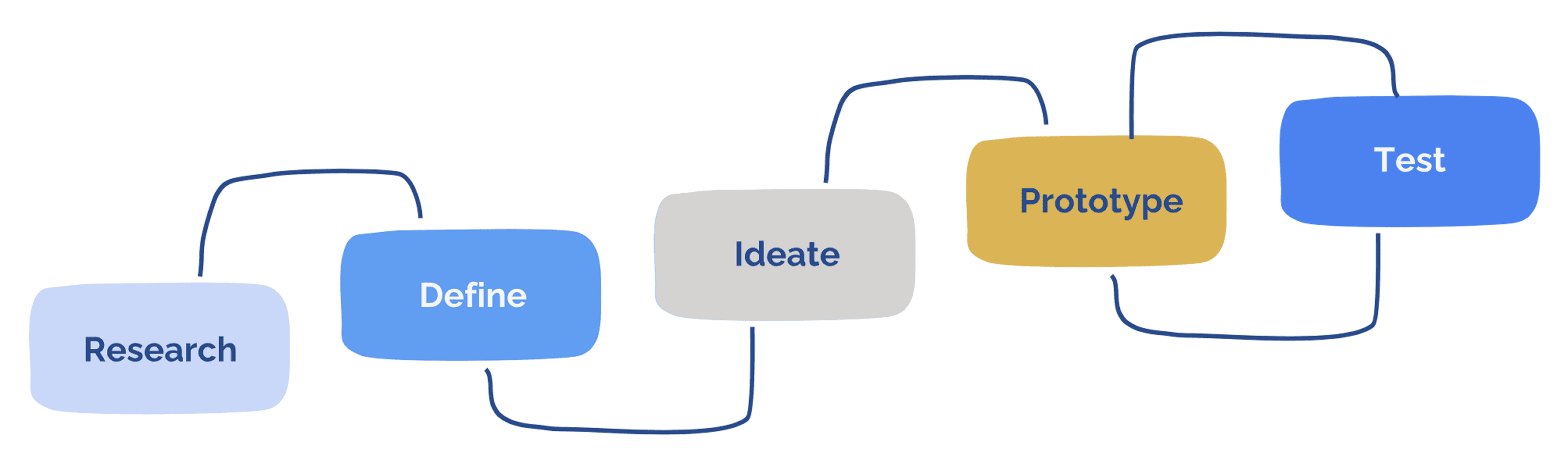
06. THE DESIGN PROCESS
To identify key pain points, we interviewed five office owners on MonCab.
To identify key pain points, we interviewed five office owners on MonCab.
To identify key pain points, we interviewed five office owners on MonCab.
Their main concerns included:
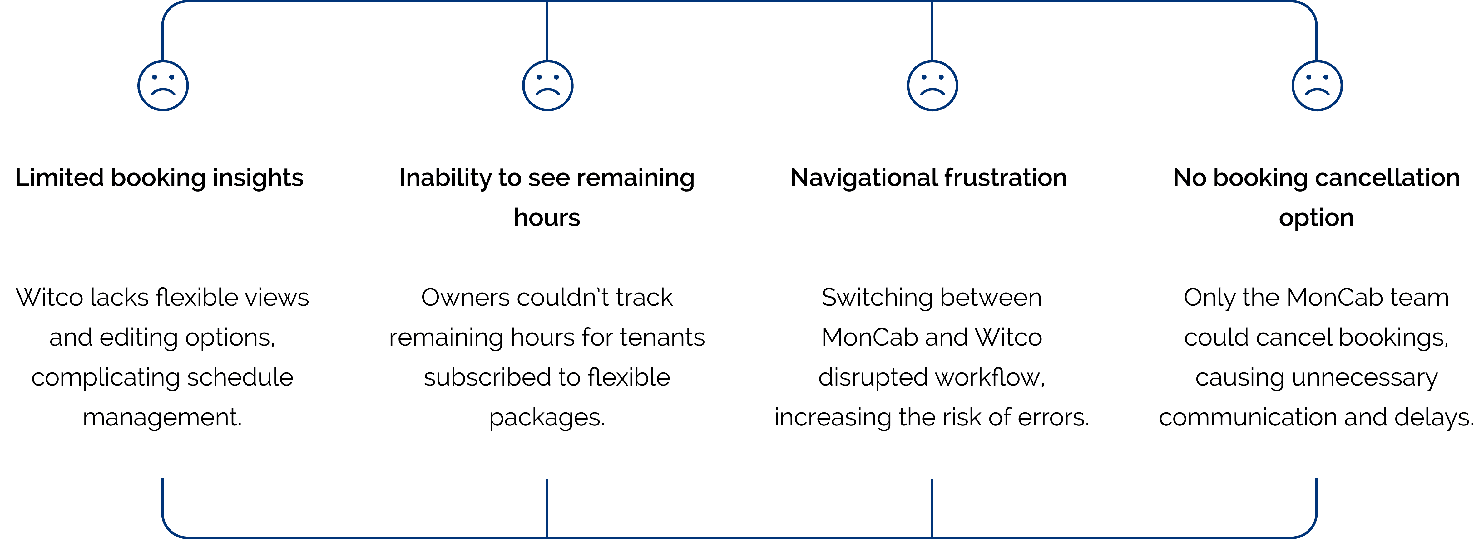
This feedback reinforced the need for an integrated calendar and dashboard tailored to MonCab’s specific needs.
This feedback reinforced the need for an integrated calendar and dashboard tailored to MonCab’s specific needs.
This feedback reinforced the need for an integrated calendar and dashboard tailored to MonCab’s specific needs.

We examined direct and indirect competitors and found that most medical office rental platforms do not display office availability publicly. Instead, they require users to schedule meetings before confirming bookings, which slows down the process and discourages potential tenants.
We examined direct and indirect competitors and found that most medical office rental platforms do not display office availability publicly. Instead, they require users to schedule meetings before confirming bookings, which slows down the process and discourages potential tenants.
We examined direct and indirect competitors and found that most medical office rental platforms do not display office availability publicly. Instead, they require users to schedule meetings before confirming bookings, which slows down the process and discourages potential tenants.

To improve transparency and efficiency, we decided that MonCab should display available time slots upfront—similar to Airbnb—so users could see availability before messaging an owner. This would encourage faster decision-making and reduce unnecessary communication.
To improve transparency and efficiency, we decided that MonCab should display available time slots upfront—similar to Airbnb—so users could see availability before messaging an owner. This would encourage faster decision-making and reduce unnecessary communication.
To improve transparency and efficiency, we decided that MonCab should display available time slots upfront—similar to Airbnb—so users could see availability before messaging an owner. This would encourage faster decision-making and reduce unnecessary communication.

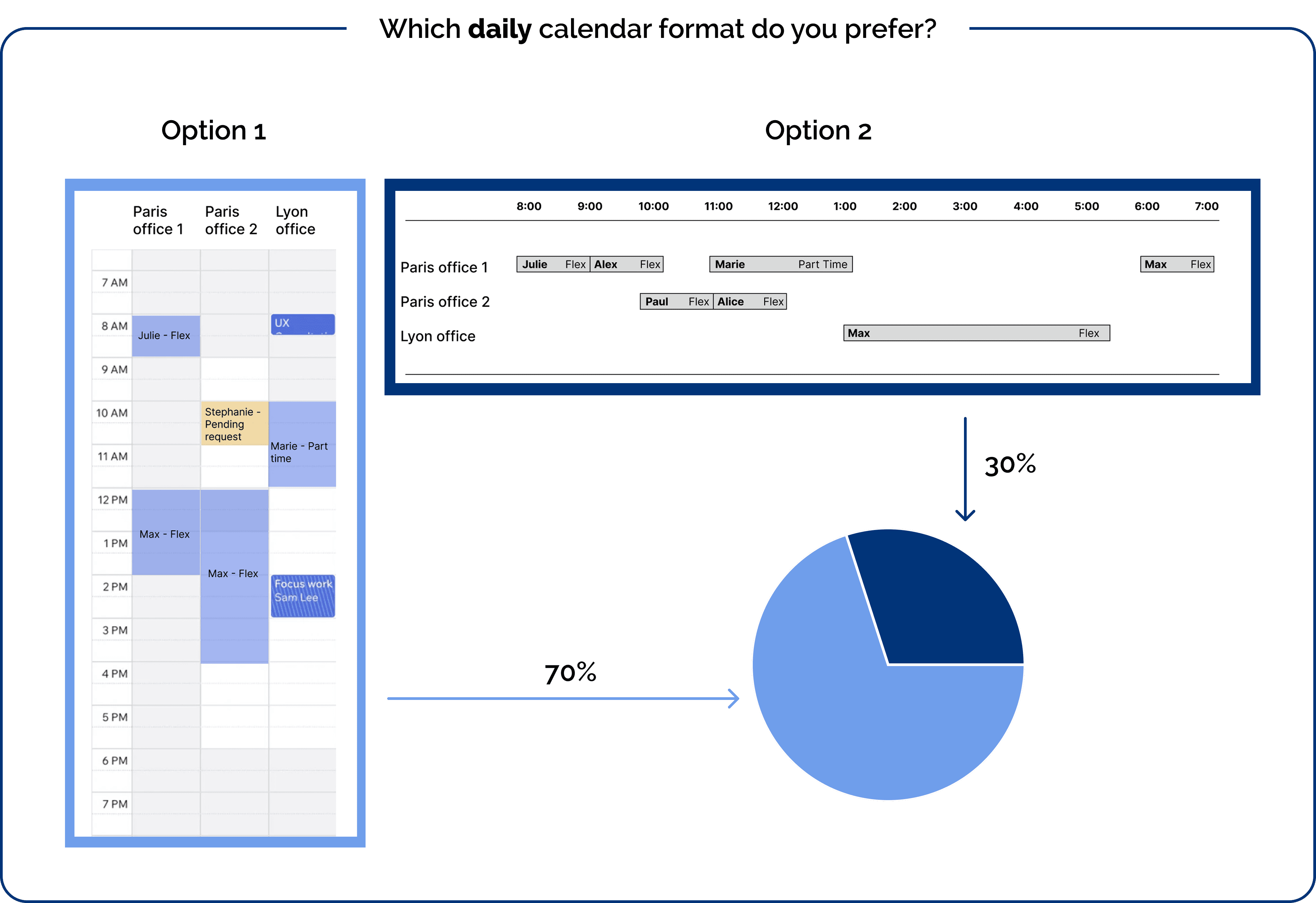
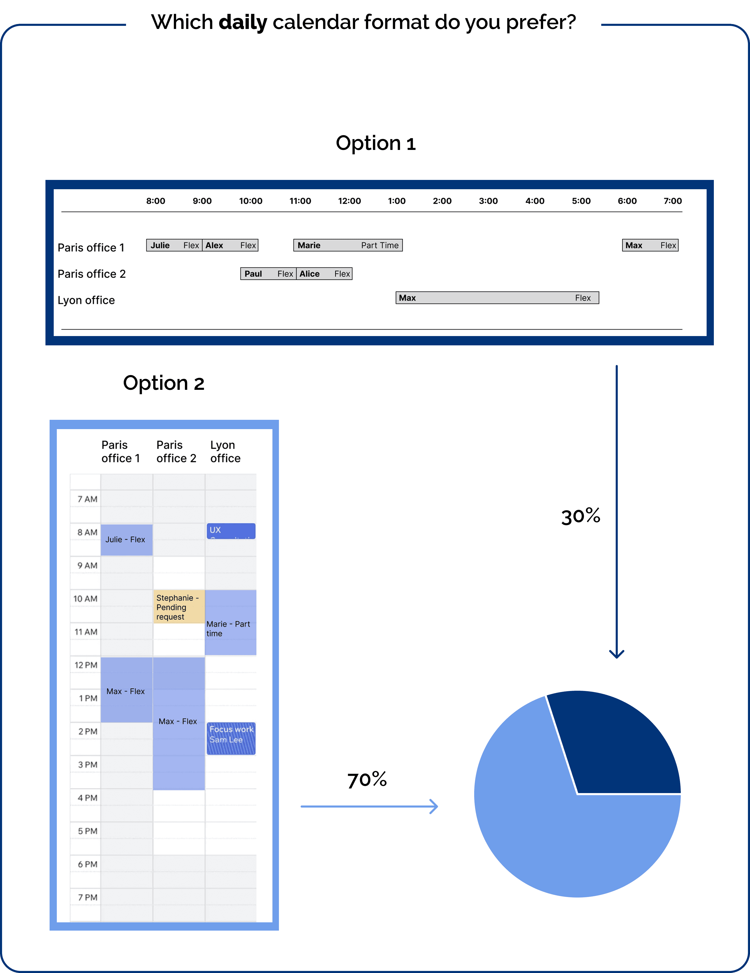
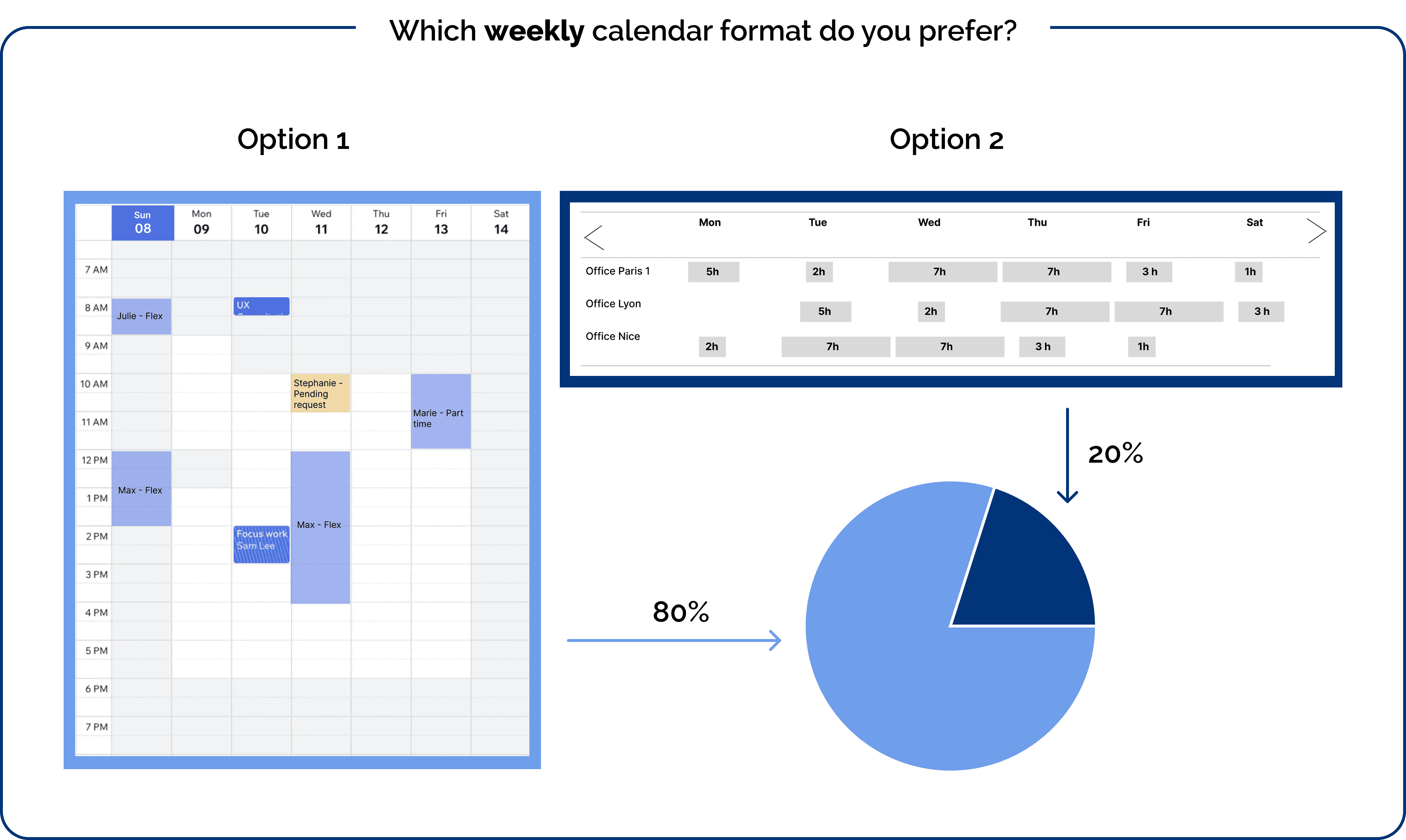
We created multiple low-fidelity calendar view options. To ensure the final product was truly user-centric, we surveyed 10 office owners to identify their preferred scheduling views.
We created multiple low-fidelity calendar view options. To ensure the final product was truly user-centric, we surveyed 10 office owners to identify their preferred scheduling views.
We created multiple low-fidelity calendar view options. To ensure the final product was truly user-centric, we surveyed 10 office owners to identify their preferred scheduling views.
Most preferred daily and weekly views over monthly or yearly, so we focused on those first.
What is most important for you to see?
Daily Calendar View
Daily Calendar View
100%
100%
100%
Weekly Calendar View
Weekly Calendar View
100%
100%
100%
Monthly Calendar View
Monthly Calendar View
30%
30%
30%
Yearly Calendar View
Yearly Calendar View
0%
0%
0%
We designed low-fidelity mockups of the daily calendar and tested two versions: vertical and horizontal. Users strongly preferred the vertical layout, as it resembled familiar agenda-style schedules. The same preference applied to the weekly calendar.
We designed low-fidelity mockups of the daily calendar and tested two versions: vertical and horizontal. Users strongly preferred the vertical layout, as it resembled familiar agenda-style schedules. The same preference applied to the weekly calendar.
We designed low-fidelity mockups of the daily calendar and tested two versions: vertical and horizontal. Users strongly preferred the vertical layout, as it resembled familiar agenda-style schedules. The same preference applied to the weekly calendar.
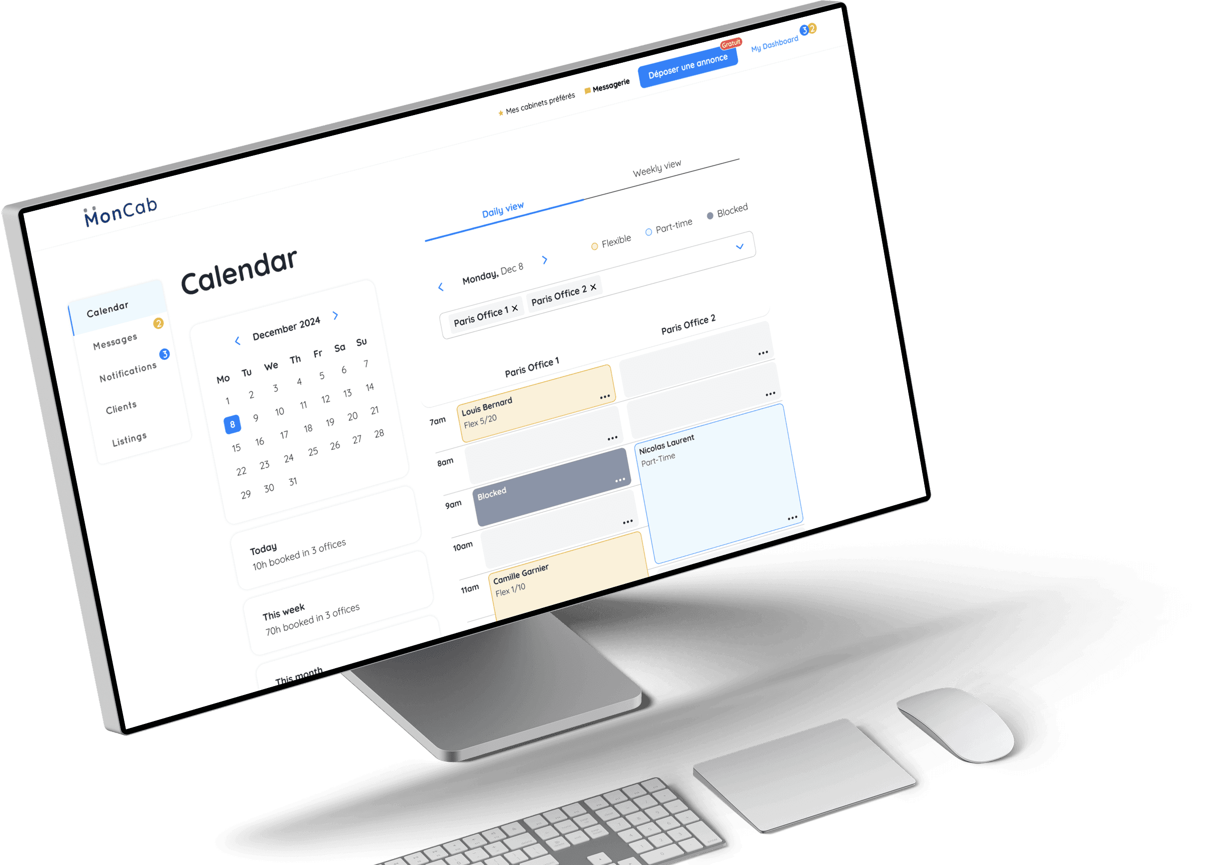
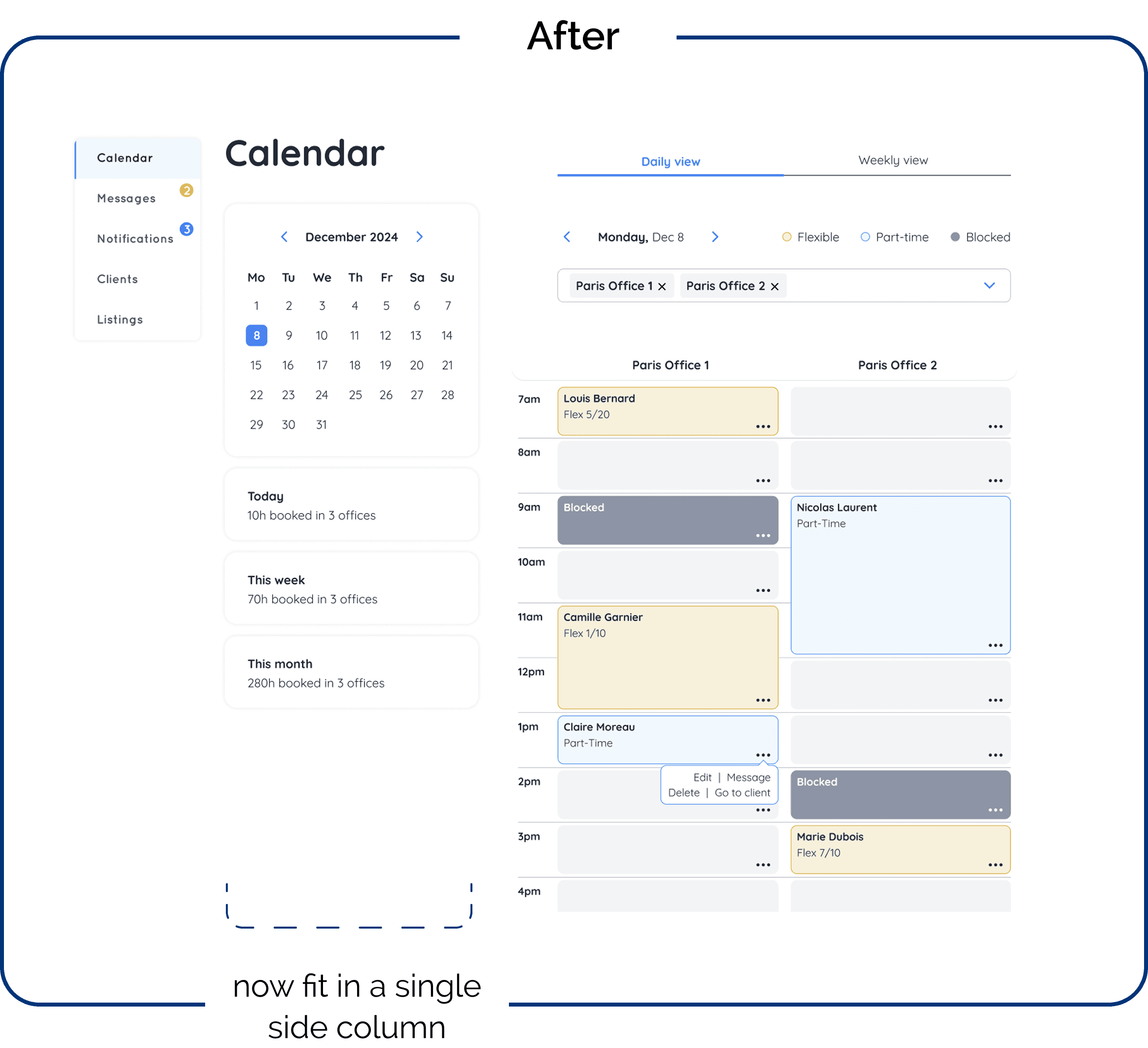
The Calendar and Dashboard Outcome
We implemented a toggle switch, allowing owners to easily switch between daily and weekly views.
We implemented a toggle switch, allowing owners to easily switch between daily and weekly views.
We implemented a toggle switch, allowing owners to easily switch between daily and weekly views.
Daily View
Displays multiple offices side by side, allowing owners to see their schedule at a glance.
The schedule is color-coded: blue for part-time bookings, showing the tenant's name along with action options (edit, delete, message), and yellow for flexible package bookings, displaying the tenant’s name along with their remaining flexible package hours, as well as actions (edit, delete, message).
Weekly View
Since space is limited, only one office is shown at a time.
Booked time slots are also color-coded (blue for flexible packages and yellow for part-time clients). When hovering over a slot, owners can see tenant details, remaining hours, and actions (delete, edit, message).
The actions—delete, edit, message, block, unblock, and add client—were also tested to ensure efficiency and speed, streamlining the booking management process for owners.
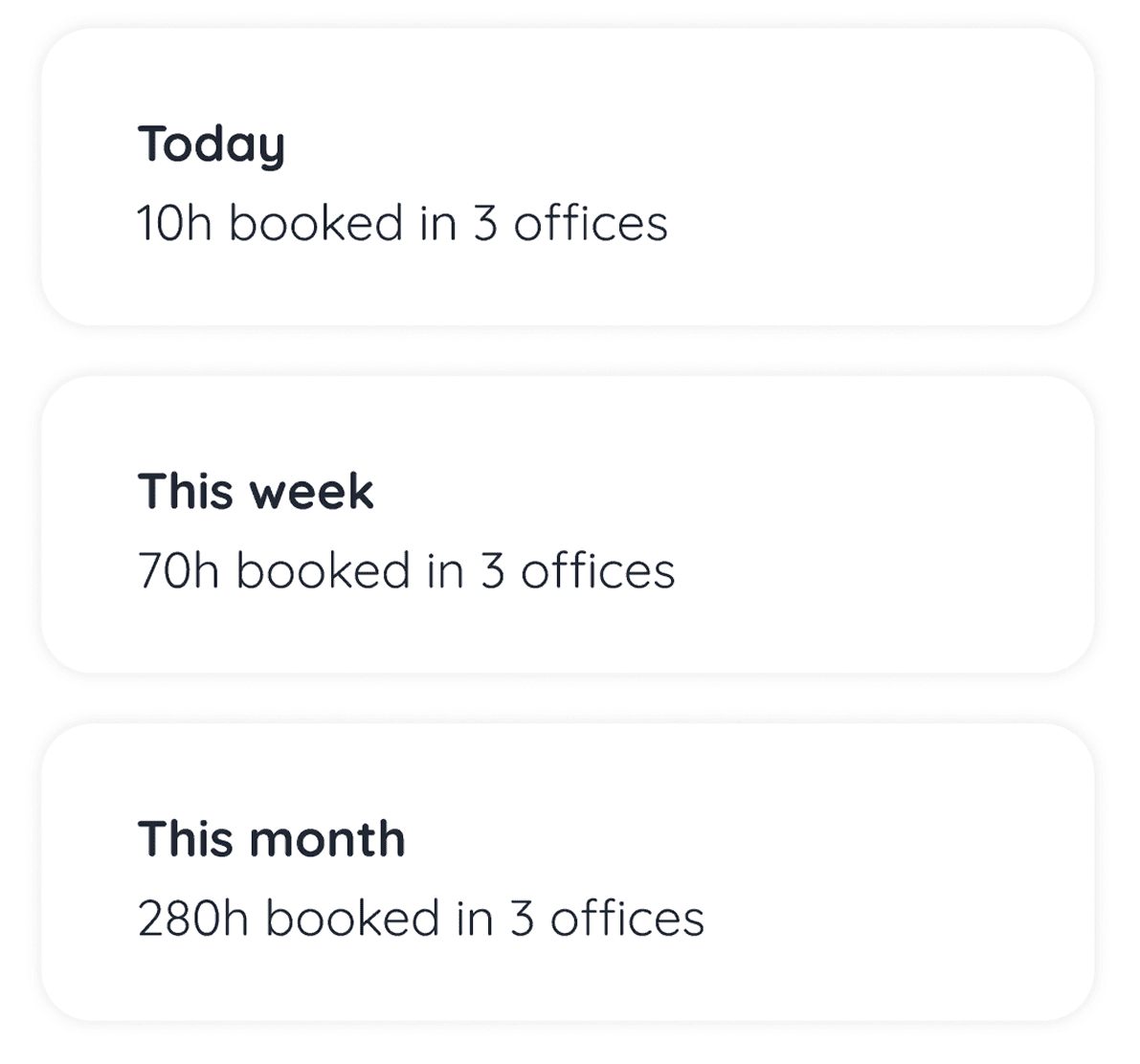
We also included booking summary cards:
We also included booking summary cards:
We also included booking summary cards:
A real-time overview of total booked hours across all listings, with daily, weekly, and monthly summaries.

Dashboard Enhancements
During ideation, we identified many potential features but focused only on the essential ones for this phase. To prioritize, we used the MoSCoW method:
Must Have
Should Have
Could Have
Won’t Have (for now)
Once finalized, we distributed the page designs among ourselves using a "divide and conquer" approach, streamlining the process and ensuring efficiency.
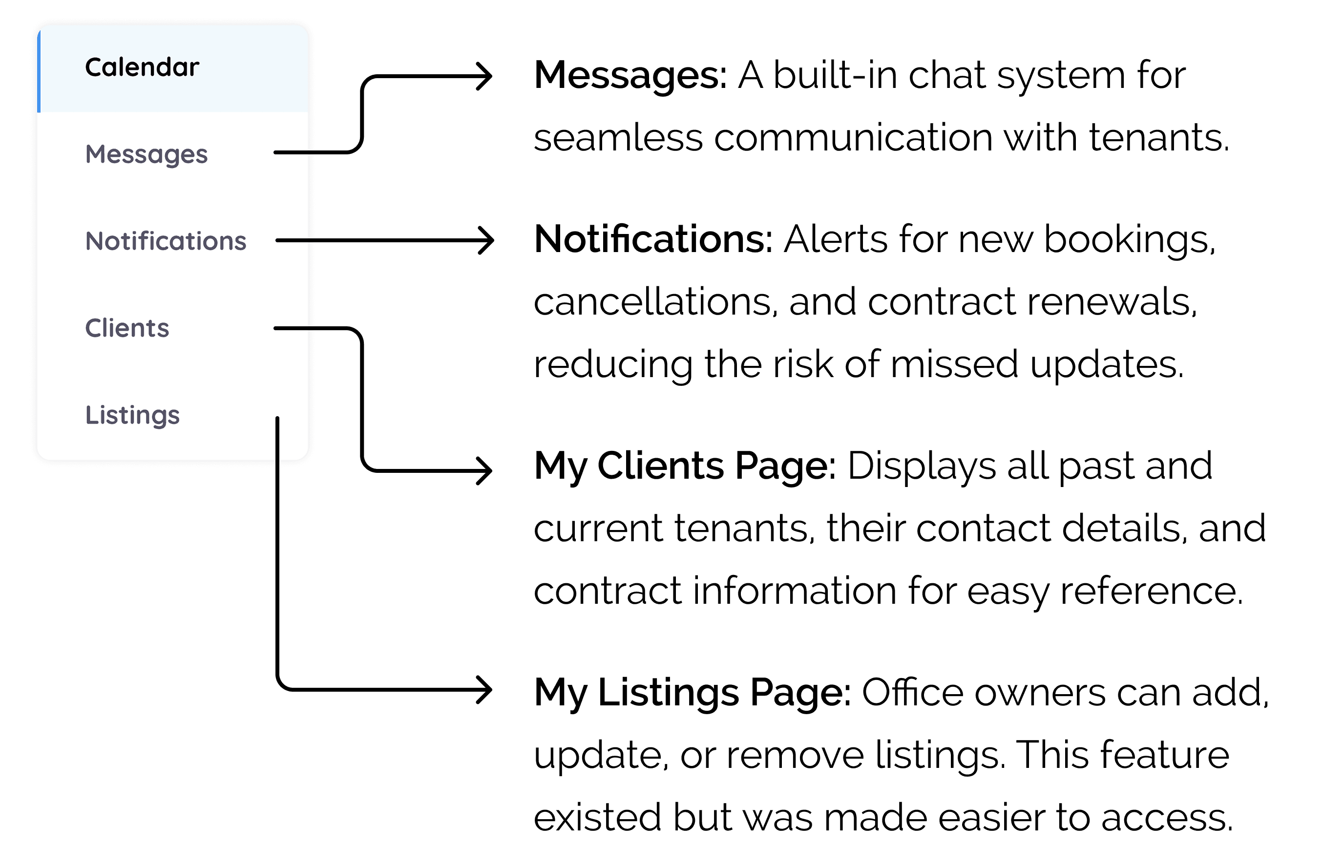
The new dashboard design now incorporates the following pages:
The Main Design Iterations
We received insightful feedback on our low-fidelity prototypes, which allowed us to identify what was working well and what needed to be refined or removed. The user feedback was essential in guiding these adjustments.
We received insightful feedback on our low-fidelity prototypes, which allowed us to identify what was working well and what needed to be refined or removed. The user feedback was essential in guiding these adjustments.
We received insightful feedback on our low-fidelity prototypes, which allowed us to identify what was working well and what needed to be refined or removed. The user feedback was essential in guiding these adjustments.
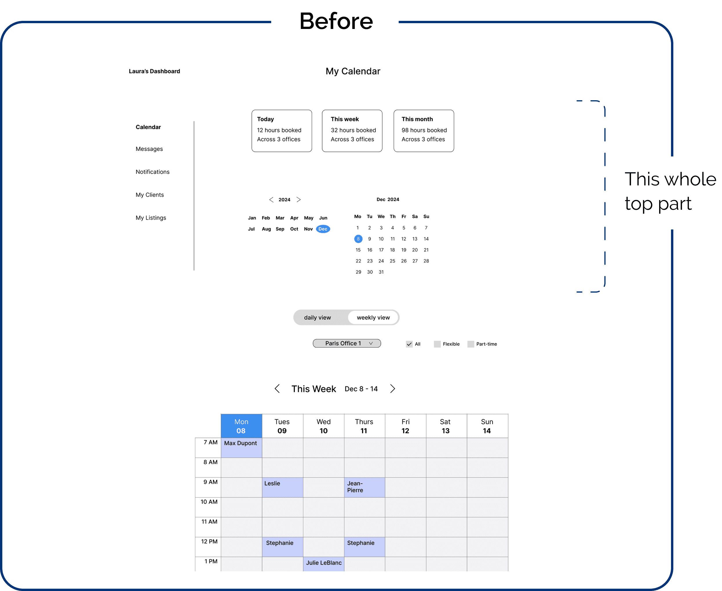
1- The layout of the dashboard
Problem: The first visible screen displayed less important information to our users. They primarily wanted to see the schedule with their tenants' bookings, the duration of each session, and the remaining hours for flexible package bookings.
Problem: The first visible screen displayed less important information to our users. They primarily wanted to see the schedule with their tenants' bookings, the duration of each session, and the remaining hours for flexible package bookings.
Problem: The first visible screen displayed less important information to our users. They primarily wanted to see the schedule with their tenants' bookings, the duration of each session, and the remaining hours for flexible package bookings.
How we solved it: We focused on making the schedule immediately visible. allowing users to navigate the calendar and see the schedule automatically update in real-time as they make changes. This made the schedule more accessible and prioritized the information that office owners needed most.
How we solved it: We focused on making the schedule immediately visible. allowing users to navigate the calendar and see the schedule automatically update in real-time as they make changes. This made the schedule more accessible and prioritized the information that office owners needed most.
How we solved it: We focused on making the schedule immediately visible. allowing users to navigate the calendar and see the schedule automatically update in real-time as they make changes. This made the schedule more accessible and prioritized the information that office owners needed most.
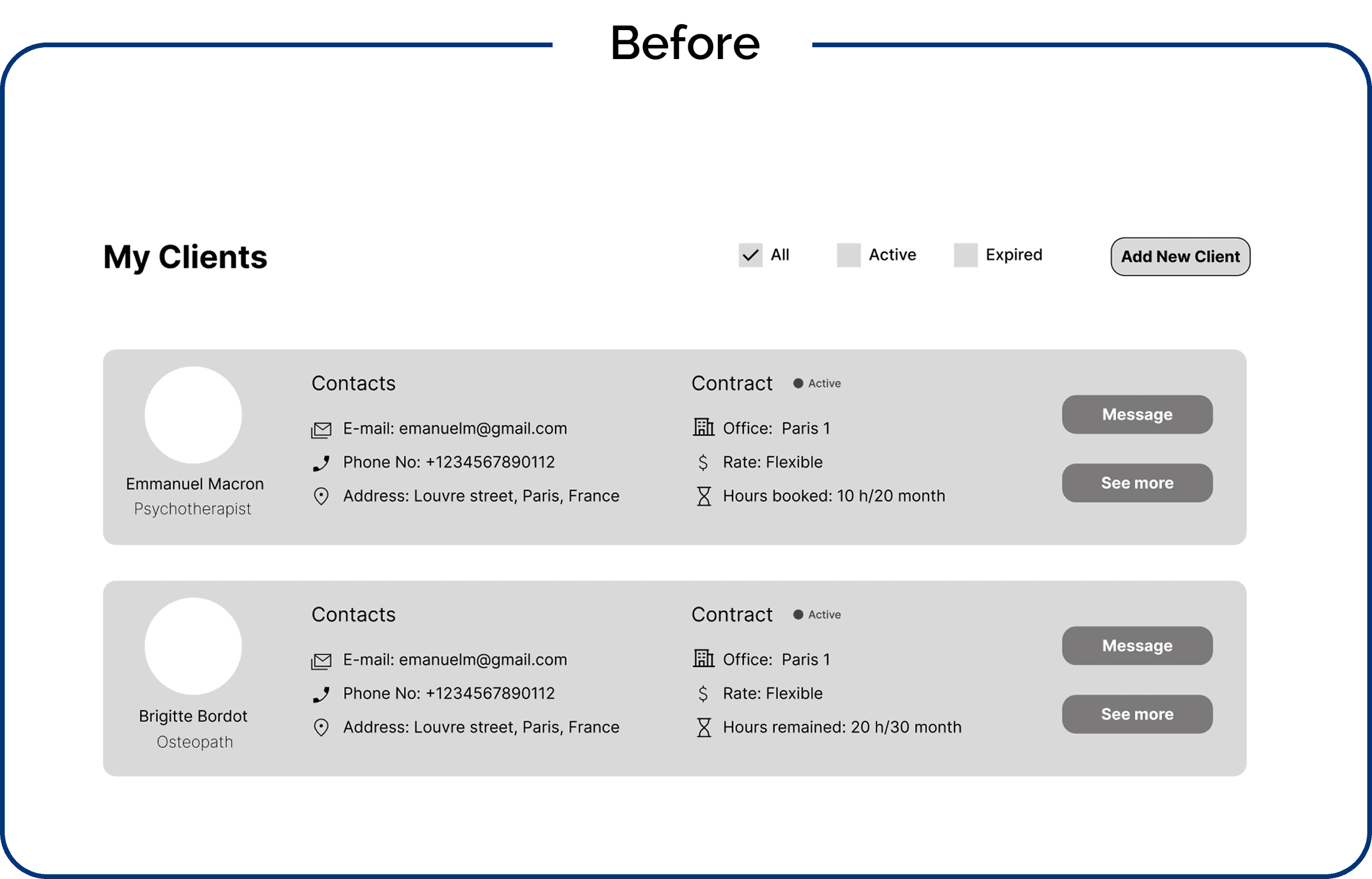
2- The clients display in Clients page
Problem: Each client was displayed in a separate card, taking up excessive screen space unnecessarily.
Problem: Each client was displayed in a separate card, taking up excessive screen space unnecessarily.
Problem: Each client was displayed in a separate card, taking up excessive screen space unnecessarily.
How we solved it: I switched to a list view, allowing more clients to fit on the screen while displaying the essential information. Owners can click on a client's name to view more details.
How we solved it: I switched to a list view, allowing more clients to fit on the screen while displaying the essential information. Owners can click on a client's name to view more details.
How we solved it: I switched to a list view, allowing more clients to fit on the screen while displaying the essential information. Owners can click on a client's name to view more details.
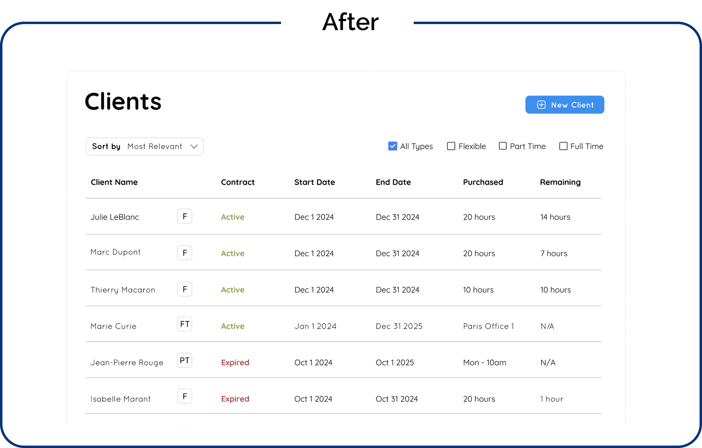
The clients page design process turned out to be really fun. It felt like solving a puzzle—thinking about how to design the flow and how everything would link together across screens.
Questions like: "Where should the contract renewal option be placed?", "How do I add a new client?", "Where should clients’ contract history be accessible?", and "How do I link a client to an office?"—all became key pieces to consider as I worked on the design. It was rewarding to refine and organize these features to create a seamless experience for the users.
Another fun part was designing the notifications page to alert owners when clients renew contracts, book or cancel time slots, or reach their flexible hours quota or part-time contract end.
I organized these updates into five tags that owners can filter from:
Booked, Purchased, Cancelled, Expired, and Reached Quota.
This structure makes it easy for owners to filter and access key updates, streamlining their business management.

Et, VOILA! This is how MonCab got a face lift.
Et, VOILA! This is how MonCab got a face lift.
Et, VOILA! This is how MonCab got a face lift.
This project successfully addressed the core inefficiencies in MonCab’s booking system by integrating a seamless, user-friendly calendar and dashboard. The improvements eliminated the need for external apps, reduced admin workload, and provided office owners with greater control over their bookings.
We learned a valuable lesson throughout this journey: it’s always better to underpromise and overdeliver rather than to raise expectations and risk underdelivering. This approach helped us stay focused on delivering what was most important to the owners and allowed us to provide a more polished and functional result.
With these foundations in place, MonCab is now equipped to scale its services while maintaining an intuitive and efficient booking system for medical professionals.
10. FINAL DESKTOP WEBSITE PROTOTYPE
(Sound on! I’m walking you through this prototype)
10. FINAL DESKTOP WEBSITE PROTOTYPE
(Sound on! I’m walking you through this prototype)
10. FINAL DESKTOP WEBSITE PROTOTYPE
(Sound on! I’m walking you through this prototype)
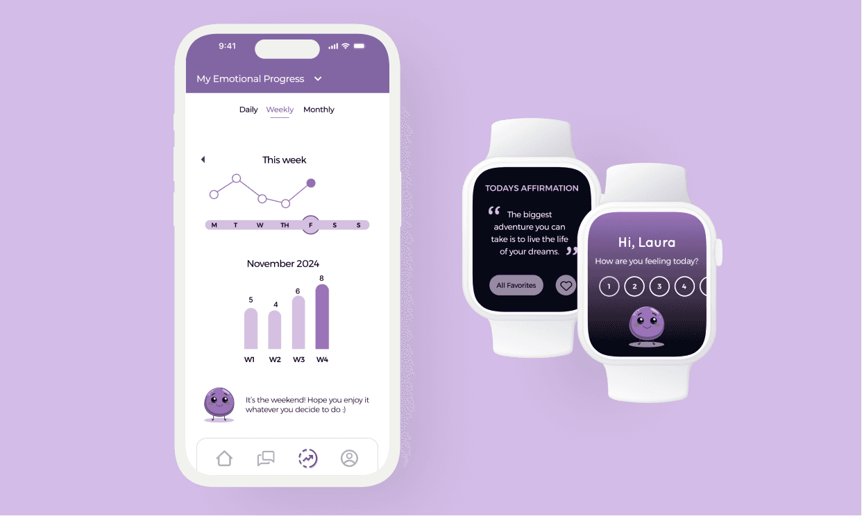
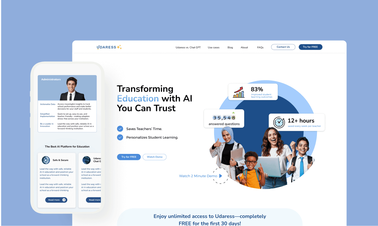
Enjoyed reading?
Explore more of my work
Explore more of my work
Explore more of my work
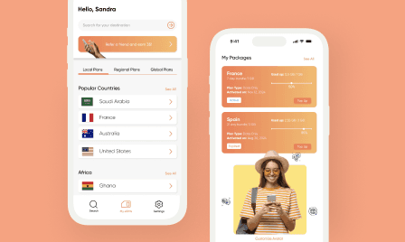
Ⓒ 2025 Sandra Fayad. All right reserved.
Ⓒ 2025 Sandra Fayad. All right reserved.
Ⓒ 2025 Sandra Fayad. All right reserved.